The Dreaming Way Lenormand & Tarot


Kwon Shina created the artwork for the two decks I want to look at in this post today: The Dreaming Way Lenormand and The Dreaming Way Tarot.


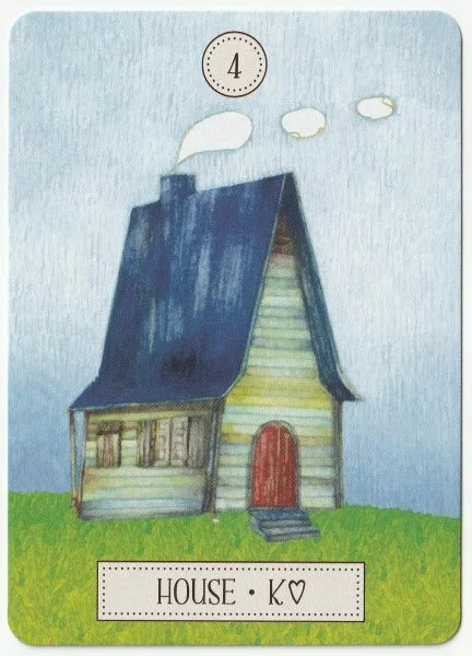
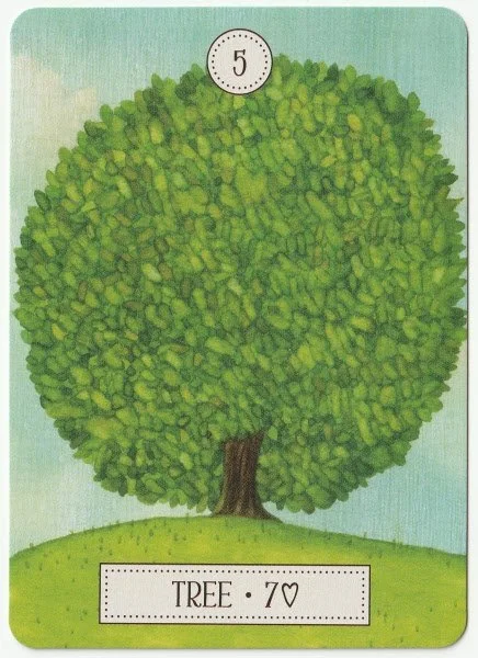
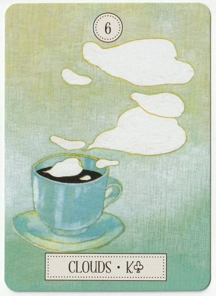


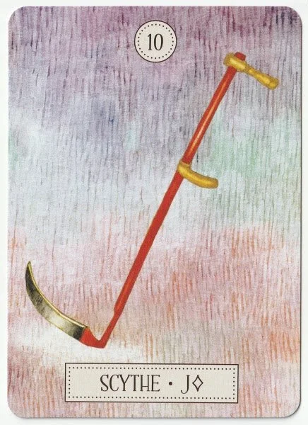

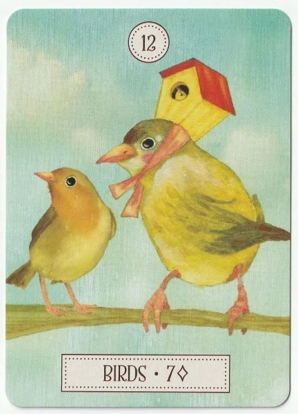


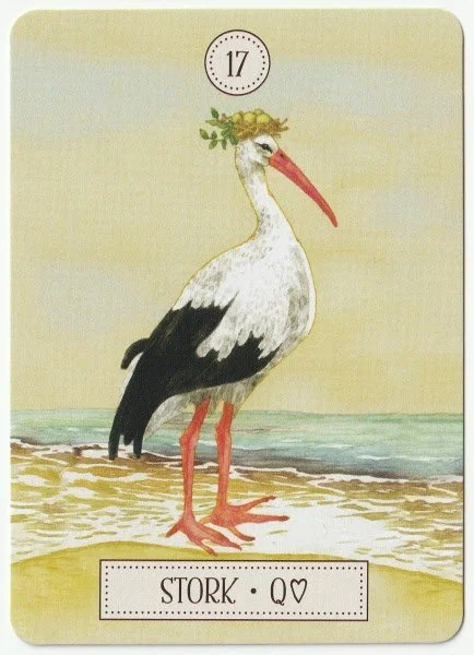
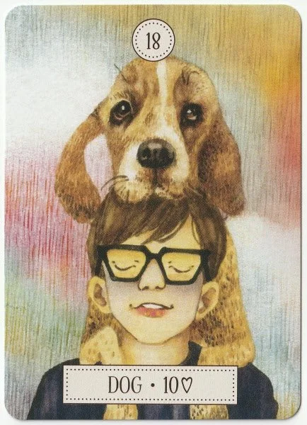


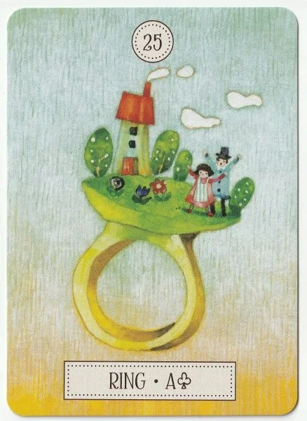


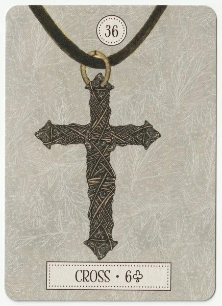
The Dreaming Way Lenormand was published in 2016, and Shina teamed up with writer Lynn Araujo. Lenormand cards are nearly always smaller than tarot, which makes the deck easy to handle, especially as there are only thirty-six cards. The Dreaming Way is a standard Lenormand, but the artwork is quirky enough to make it stand out. I like the rider facing backwards in card 1. Rider, although I’m not sure if that modifies the meaning because I haven’t worked with them enough. 3. Ship is sailing in a bowl. 8. Coffin shows a girl lying in a sardine can. I also like 22. Choices, and its maze-like walls with a ladder visible in the distance. Both the 31. Sun, and 32. Moon are sweet cards. The Sun is depicted as a burnt orange flower with a spiral emanating from the centre, exuding warmth and optimism. It’s a familiar sight for me because it appears in The Dreaming Way Tarot as part of The Fool imagery. The Moon shows a small rabbit working magic while standing on the moon. The booklet is surprisingly good for its size, and I’ll look at 34. Fish, as an example. The artwork shows fish swimming through rain that is falling underneath an umbrella. The booklet says, “The fish is a universal symbol of abundance. In Lenormand, the fish card indicates the flow of plentiful resources, but it is a card with a double-edged meaning. One of its messages is that too much of a good thing can be harmful. While the farmer prays for rain, torrential rains can have devastating effects. The Fish card signifies commerce, transactions, trade, opportunities, profits and prosperity. Expanding business can be a lucrative endeavor, but excessive working can lead to neglect of other important areas of life and greed can undermine the virtue of hard work. This card is also associated with the excessive behaviour that leads to addiction and alcoholism, especially near the Whips card. The Fish card is a reminder to manage resources wisely, enjoy things in moderation, and be careful what you wish for.
Keywords: Abundance, prosperity, profits, opportunities, resources, commerce, excess, immoderation.”
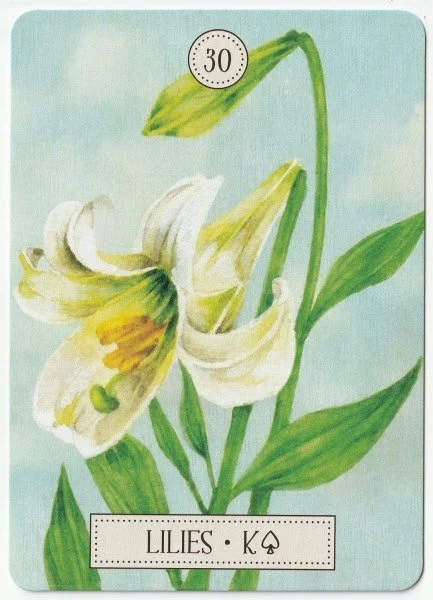
I like that we’re reminded to look at what cards are next to one another, and think the descriptions are excellent considering the size of the deck. There is also a quote given at the start of every card, which is a nice touch. I have no complaints with this deck at all. I use Lenormand for quick predictive messages, and this deck is a natural companion to The Dreaming Way Tarot. The artwork is certainly different to the tarot deck, but retains the same level of vibrancy and intensity of colour seen in its tarot companion. I am aware that some readers dislike the card names being altered, and in this deck, 11. Whip has become Whips, 22. Choices has replaced Crossroad and 30. Lillies has replaced Lily. If I had to pick a fault, it would be that the first few pages of the guidebook are just glowing reviews. It seems entirely pointless, and the space would've been better filled with something useful.
The Dreaming Way Tarot was published back in 2012, and Shina collaborated with writer Rome Choi. I used The Dreaming Way tarot for readings at the shop throughout last summer, and a fair number of people commented on how much they love the artwork. The colour palette is bold and uplifting, and there is something about the design that reminds me of Art Nouveau. Or maybe it has a Russian feel to it, I don’t know, there’s just something familiar about the style, and yet it’s different. It comes with a basic little white booklet in a tuckbox. This is standard for the publisher, but what I do appreciate about Lo Sacrabeo is that the cards are nearly always easy to handle and easy to shuffle.


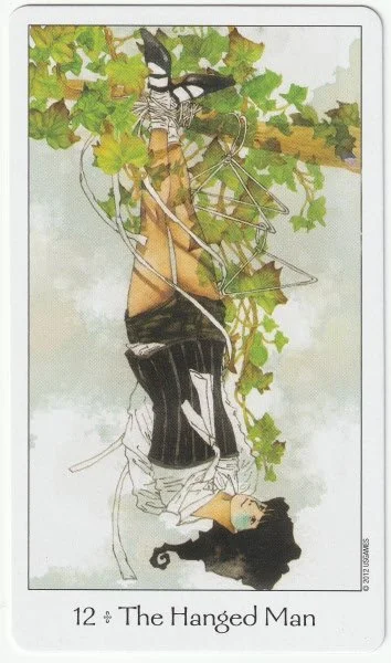


The major arcana in the tarot are pretty consistent in style and readability. As the first card in the deck, The Fool gives a good general indication of the overall style. It stays close to the Ride-Waite symbology with a person standing on the edge of a cliff. A little dog stands to the right and seems to be sniffing the air up ahead. Favourite cards in the major arcana include The High Priestess. She is used as the main image on the outside of the tuckbox, and I adore how a young woman is sitting on the moon. Interestingly, she holds a rolled-up scroll in her hands with the word ‘TORAH’. The lwb says, “The High Priestess usually indicates a beautiful, young woman (20-40 years old) who takes good care of herself. Her prim and proper air makes her seem aloof and hard to approach, but she has a warm heart. When single, she is popular among men, but after marriage she becomes quite reserved and passive.
UPRIGHT: Taking care of herself well, elegant, organized, patient, well educated, generous, cultivated, teacher.
REVERSED: Self-indulgent, self-absorbed, passionate sex life, suspicious of her partner.”
The description is better than many lwb's, and I like that we have a description as well as upright and reversed meanings.
I’m not sure about the description for The Lovers because it talks about the middle person being an angel who strengthens and blesses their bond. Because the figure is standing between the couple, I see her as an interfering force. The butterfly wings could suggest frivolity and flights of fancy that distract the couple. The reversed meaning says “Mistaking attraction for love, obsession, manipulation, deceit or delusion.” I read cards in pairs rather than using reversals, and even when this one comes up with a good card, I wouldn’t take it as a great relationship indicator.
The Chariot is a wonderfully active-looking card with a rider who looks totally in control. The horses look to be pulling in the same direction, so here we could have a chariot card that doesn’t suggest the usual negative of being pulled in different directions. If anything, it could be rashness that causes problems. The Hermit is another lovely card, and like the other cards, it’s easy to read through imagery alone. I like how he’s walking through a forest with his staff and lantern. The spinning wheel imagery for The Wheel of Fortune could indicate a past, present, future theme, or at least the need to be more aware of historic cycles. The artwork for the Death card is nice and simple. I like that Kwon has used a woman to hold the scythe.
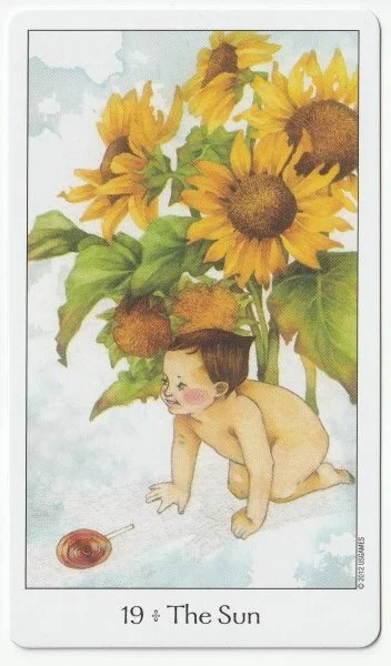
The Devil imagery emphasises bondage between two people whose chains are held by a female devil. The Devil herself appears to be bound on her upper body, restricting the movement of her arms. I know it’s not a ‘good’ card to appear in a reading, but I love the way Kwon has worked the symbolism. There’s no misunderstanding with the meaning of The Tower card. The building is completely collapsing. Some decks soften the depiction, but that is not the case here. I love the baby crawling among sunflowers in The Sun card, and while The Sun can indicate the birth of a child, I don’t feel the artwork limits the imagination to extend its meaning into creativity and happiness. All in all, the majors are suitable for beginners or those early in their tarot journey.


I like the colours and contrast in the suit of Cups. The artwork for the Five of Cups is lovely. Two women stand back to back, with the one facing the reader holding two cups in either hand. The woman behind her can be seen with the other three cups; one of which is upside down, its contents spilling out. When this card appears, we are often told to focus on what we still have, rather than what is lost. The lwb says Upright: Disappointment, focused on shortcomings, sorrow, defeat, deep regret.
Reversed: Satisfaction, ignoring strengths and finding weaknesses, fearful of completion.
I think Kwon got the balance just right with this image. You can see the disappointment and resignation in the woman holding the two cups, but she’s not crying.
In the artwork for the Seven of Cups, we have the seven cups with something different in each. It’s a fairly typical depiction, which isn’t a bad thing because it makes the deck more accessible to beginners. It’s one of those cards where the artwork rarely gets the full message across: the level of self-deception, denial, and general delusion is usually off the chart when this card shows up in a reading. Sometimes, it’s just your bog-standard addiction issues, or it can be a nasty bout of limerence. Whatever the case may be, seven cups filled with various images don’t evoke the reality. Which, considering the card's meaning, is a bit ironic.
I like the Eight of Cups, even though it’s a fairly standard depiction. I love the green-blue hues and the contrast of the black and white cups. It’s good to see the figure walking along the shoreline because it acknowledges the watery (emotional) element of the situation. She’s getting her feet wet, but doesn’t look to be in any immediate danger from waves.
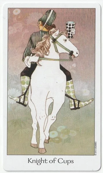
I’m a little disturbed by the Knight of Cups. Why isn’t he looking where he’s going? Can he be trusted? The horse isn’t looking where it’s going either. A curious depiction indeed.


The artwork for the Swords all stick within the traditional framework, and while the Three of Swords looks quite tame, it does at least show the swords directed towards the woman’s body. Her eyes are closed, so we have an inkling of a need for quiet and perhaps solitude. There could be a reluctance to face a situation with the eyes open, but her brow looks furrowed, even though we can only see half her face. It feels more like she’s closed her eyes because she needs a moment. I like it even though it doesn’t show heartbreak clearly. The Five of Swords shows one person walking off with all five swords. The figure in the background looks defeated. I would be cautious when interpreting this card because I’d wonder which figure represents the querant. That being said, I think the Five of Swords is often six of one and half a dozen of another. . . so, maybe it’d be both! I like the Eight of Swords because it clearly shows that the figure is only restricted from going backwards. The blindfold may be a bit of an issue, but her hands are unbound. I can work easily with this image. The lwb says, Upright: Falling into a trap by oneself, having ability to solve the problem but not seeing it, feeling victimized, restricted, expecting to be rescued.
Reversed: Exploring all choices, breaking out of circumstances, empowerment, finding a solution.
People often come for readings when they’re stuck in the Eight of Swords. I understand how easy it is to fall into a trap, and generally find that as soon as they start communication clearly, it’s much easier to help them see the way forward.
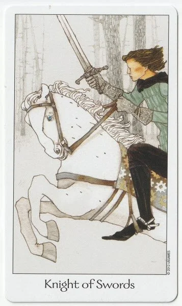
The Nine of Swords stays faithful to the traditional interpretation — the stress and insomnia are easy to read from the image. Holding her head shows that much of the problem is a mental one. And again, with the Ten of Swords, we have a nice traditional representation with a figure lying on the floor with the ten swords all in the body. I’m not sure what’s going on with the knights in this deck; we have the Knight of Swords facing forward, but his horse is not. This could indicate a need to gain more control over one's actions.


In the lwb, it says of the Wands:
Emotional, masculine, progressive, fire, and body.
Wands cards often relate to jobs or creative works, the endeavors that we find most interesting and the things we do with passion, confidence, and fervor. Male sexual desire also belongs to wands area.
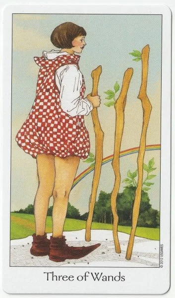
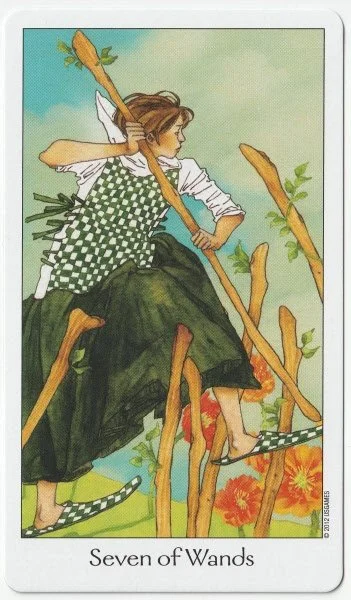
I don’t usually see wands as relating to the body because that belongs to the Pentacles/earth element for me. Although it’s something I will keep in mind when using this specific deck. The Five of Wands shows five people with wands, and the person looking straight towards the reader has a pained expression on her face. It’s a card of conflict with others, and here there’s an indication of things being fuelled by the words of others. The Seven of Wands is a lovely depiction of defending oneself. The woman has an exceptionally strong posture despite not having her feet firmly on the ground. I like that the Nine of Wands shows a person resting. I know the meaning of this card is often linked to perseverance, but it’s always better to contemplate before taking any further action. The astrological correlation to the nine is the Moon in Sagittarius. Bringing that into the interpretation suggests a need for emotional exploration, or maybe exploration of the emotions. Being philosophical will help.
I have to mention the Knight of Wands because, well, just because. He’s looking over his shoulder. Is he looking to see if his friends are still following, or is he checking to see that he isn’t being followed by an enemy? The Queen of Wands looks bored, or maybe she’s deep in thought. I love the sunflowers on her throne and her checkerboard crown. I’m surprised to see her in a white gown, though.


The Pentacles are my least favourite suit as far as the artwork is concerned. There’s nothing wrong with it, I just find it less interesting when compared to the others. Like the rest of the deck, many of the images stay close to traditional depictions of the card meanings. Of the Pentacles as a suit, the lwb says: Rational, feminine, conservative, earth and materials.
Pentacles relate not only to money but also to material goods. The reason we desire money is not always to live extravagant lives. We need money to sustain our lives. Pentacles indicate indispensable things and security. The four areas that make us feel safe are: money (materials), body (health), emotion (family and friends) and mind (knowledge and wisdom), all of which are included in pentacles, and each is related to the Minor 4 suit.
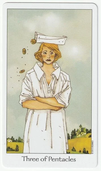
The Three of Pentacles is a little difficult to interpret through the image alone. The woman looks unhappy, yet coins fall from a box balanced on her head. The lwb says, Upright: There are benefits now, but they are insubstantial and temporary, competent but not expert. Reversed: Profits are small and are decreasing, unsatisfying job, unproductive work. Much of this goes against my general understanding of the card, which I generally interpret as productivity, teamwork, and working one's way up. Thankfully, the Five of Pentacles is much easier and shows a fairly standard image of a barefoot woman in rags. We can see five pentacles inside a building just behind her. The Nine of Pentacles can be an odd card to decipher through imagery alone, and the one in the Dreaming Way Tarot is no different. It shows a woman in an elaborate dress, carrying a basket that contains a pentacle. You can certainly get the idea of someone who is doing well in the physical world, and her stance does give off an air of independence and strength.
I am mostly happy with the Knight of Pentacles because he is actually facing forward on his horse, and the horse looks calm, focused, and is also facing in the same direction as its rider. That being said, he’s generally the slowest out of the four knights, and a bit predictable and boring. I suppose it's a small price to pay if he gets to his chosen destination.
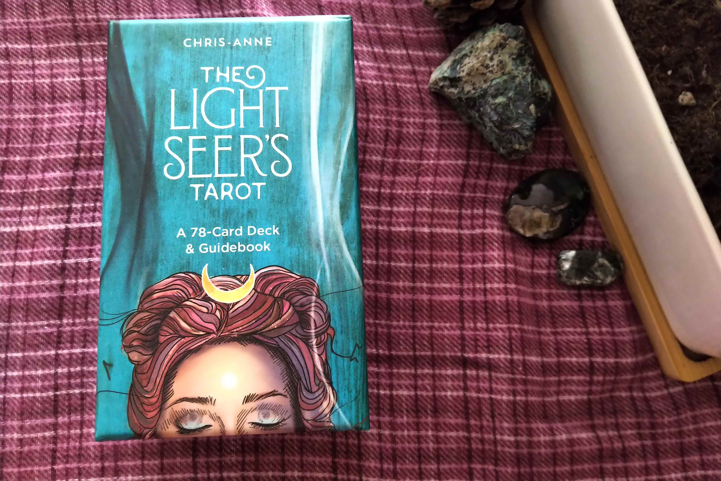
Honestly, the Dreaming Way Tarot is a lovely deck that is absolutely fine as an introduction to tarot. Because the artwork is consistently straightforward and clear, it can be a good deck to use if you need a break from decks that are much heavier or more intense in tone. Visually, the artwork is unobtrusive: The bright greens on the back of the cards make you want to reach for the deck. It feels uplifting and innocent. It offers a rich canvas, and yet it leaves space for calm interpretation. I find its artwork to be more appealing than other easy decks, such as The Light Seers Tarot. The Dreaming Way Tarot doesn't feel like it's pushing a lifestyle or mindset. The lwb could've done with a little bit of editing, and the interpretations don't always align with the artwork. But, with a booklet that size, you're always going to need to buy a better book if you don't have much experience with the cards.
Recent Posts


Archives
Categories
- Animal-centred
- Books
- Decks For Self-development
- Difficult Decks
- Expensive Decks
- Lenormand Decks
- Oracle Cards
- Oracle Cards For Beginners
- Out-of-print
- Personal Favourites
- Published 2000s
- Published 2010s
- Published 2020s
- Tarot
- Tarot & Oracle Sets
- Tarot Cards For Beginners
- Under £15
- Under £20
- Under £30
- Under £40
- Witchy Decks
- Woman-centred