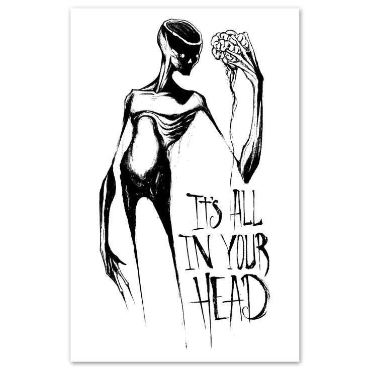
It’s All in Your Head: Some analysis & a review
Shawn Coss
I was visiting one of my daughters the other day, and she mentioned she’d been gifted a book, and she’d had to put it down because she was at the point of flinging it off the balcony.
“It could just be me, though, mum. You might like it, and I’m maybe just being a dick. I don’t think he knows what he’s on about, and I ain’t getting some of the art.”
As she handed it over, I could see that I quite liked the art style. It was close enough to imagery that I knew I’d enjoy looking at, but I was concerned about the writing. Daughter hadn’t even got a quarter of the way through the book before her irritation had risen high enough to reject the entire thing.
That night, with Buffy the Vampire Slayer on the TV in the background, I stuck my nose into the book and made it as far as the conditions that began with the letter C before the cringe was so loud I had to put the book to one side. The images weren’t really giving off what they were said to represent, and the written text seemed to lack any depth or understanding.
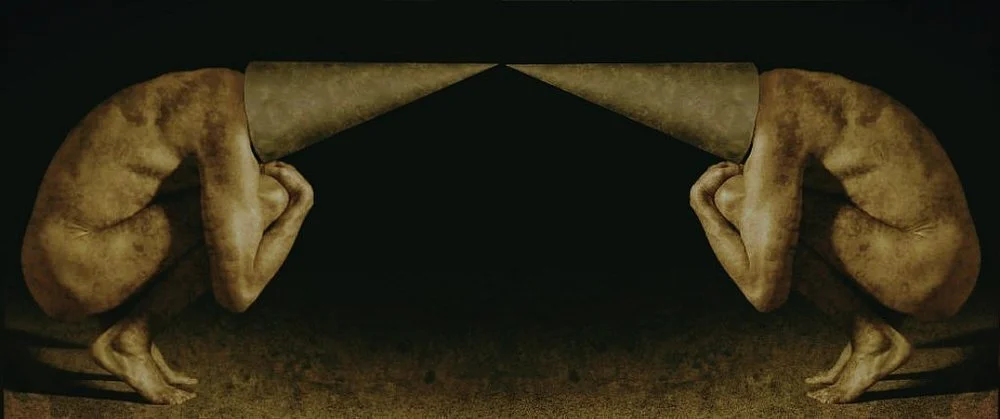
I’m not quite sure why I’m reviewing the book when I already know that I don’t think it’s anything special. An aspect of me is certainly curious enough to analyse a couple of randomly chosen images from the book to see what I can actually see, but I don’t want to leave it at that and will also look at the project in its entirety. And, just because, I’m looking at two images completely unrelated to the project that I feel quite drawn to.
It’s All in Your Head was published by Ohio-based artist Shawn Coss back in 2016. He states it has sold over 150,000 copies, and the vast majority of reviews on his website are positive. The main complaint in the 1-star reviews is about the book not arriving, rather than criticising the contents of the book. While searching for copies of images related to the book on Facebook, I scrolled all the way back to the beginning of 2014. Much of the art is fairly typical of what I consider dark art tattoo style design. Some have colour, many do not. Some pieces have lots of detail, while others are fairly minimal. It’s all consistent stuff within its genre, and honestly, as an artist, he’s consistent and good at what he does.
The book itself is a decent-sized hardback 2nd edition with plenty of pages. The quality is absolutely fine, although, because it’s self-published, a good chunk of general information is missing from the front of the book, such as the year of publication and the publisher. There are no page numbers, no table of contents, and no index at the back. So, before I even get to the meat, my attention is not so much drawn to what’s there, but what is missing.
The introduction states that, “these designs are meant to give a humanoid form to the mental disorder itself, and are not meant to be a depiction of those who live with the disorder”. This quote is something I will be referring back to throughout this review. There are several different sections:
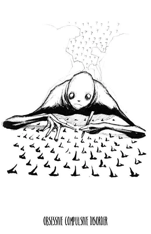
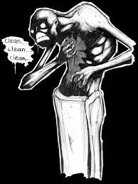
The first image for OCD is simple enough and clearly shows a repetitive pattern. The artwork is fine in itself, but I don’t think it does a good job of showing the reality of OCD. I think the part that annoys me is that it doesn't show the brutality of the obsessive thoughts, which is possibly the biggest factor in OCD. The outward behaviour is a consequence of the intrusive thoughts, but you generally don’t think about the action and what you feel compelled to do. The thoughts are generally quite unpleasant — if you don’t draw the 7, something really bad will happen. It’s not a question of just thinking about the number 7 and having to repeat it indefinitely. It’s the aeroplane falling out of the sky on your head, or the hairdryer catching fire if you don’t check you’ve turned it off at least six times. It’s having to go back and check you locked the door when you left the house twenty minutes ago, and the consequences of not doing so will fill your body with dread until you give in to the urge and turn back. There are a million and one ways it can manifest, but thinking of an action and carrying it out ad infinitum isn’t really it. There is no sense of urgency in the depiction, and no sign of discomfort. I also think that, despite saying he is showing the condition in a 'humanoid' form, it just looks like a depiction of the person with the condition. The humanoid is performing the condition; it’s not simply a depiction of the condition at all. This is something that repeats throughout the book, and it kind of undermines the whole premise he stated in the introduction. There was no commentary to this image, but Shawn has two other images for this condition, and another of the images appears earlier in the book and has a section of text alongside it. For reference, it’s the second pic in the gallery to the left, although it appears on a white background. (The third image doesn’t appear in the second edition, but I still wanted to include it in the added context.)
“Many were frustrated that this drawing falls back on generic tropes [. . .] limitations of a single piece of imagery has always been the biggest challenge when creating these disorders because no single image can capture the whole range of symptoms [. . .] had to study and take time to figure out which symptoms would best describe the disorder the best[. . .] I wanted to show the distress in the being’s face, caused by a realization that even though they are achieving their goal, it comes at a cost of repetition and harm to self.”
The problem I have with this is that much of the book is filled with depictions of generic tropes attached to the various disorders, and if you can’t really show the illness in a single image, why would you fill a book with artwork that isn’t doing what you claim it does?
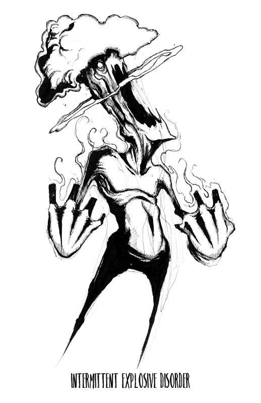
The artwork for intermittent explosive disorder appears to hone in on the explosive side pretty well, and most people would be able to relate the image to those occasions where you’re overcome by the red mist. The thing is, how is the image descriptive of the condition? It could pretty much be a visual description of anyone having a seriously bad temper. In fact, rather than portraying the condition, he has just produced someone exploding. Where is the insight into the condition in this image? How is it portraying the condition as something different to anger? The condition itself is more than just losing one’s rag to the point of incoherence. How does the image show an irrational and disproportionate reaction to a minor mishap? It doesn’t, does it. We have no sign of a trigger, no sign of any context, and no sign of the aftermath — that painfully debilitating sense of shame and remorse that generally follows an incident for sufferers of this condition. The thing is, you can’t make claims to be portraying mental illness and leave out the bulk of the condition. That’s not to say the image can’t be immediately understood by most people, because it’s very explicit in its message, but it’s almost like looking at a visual manifestation of a textbook description of anger. There is no written commentary about this condition to accompany the image in the book because it’s from the second section. But this is a bit of a problem, because as with so many mental health conditions, it’s not what we see but what we can’t see that so often causes the most distress for the sufferer. We can’t possibly understand the condition from this image, and I can’t see how it leads the sufferer towards insight nor healing. Yeah, this is what happens when you have it, but how and why does it happen? What can be done to alleviate the suffering, and what can be done to prevent these devastating outbursts? This image feels like a glorification of a serious disorder by someone who doesn’t really get the magnitude of what’s really going on.
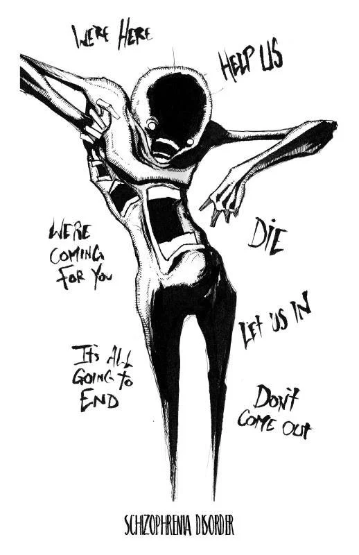
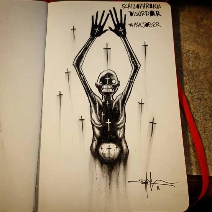
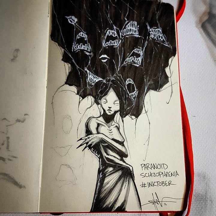
The first image for schizophrenia is far too simplistic and doesn’t really capture much of the reality. Shawn has three pictures for this condition. The pic to the left is another that doesn’t have any text alongside it, but the second and third images within the gallery do. Before I come to that, I want to explain that I find the first image seriously problematic because it appears to fall into common misconceptions that schizophrenia is just hostile, dangerous, and angry voices that seemingly appear from within the person. This actually leads to much of the demonisation of schizophrenics and reinforces negative stereotypes that ultimately harm those with the condition. In a book that purports to open up conversation on mental illness, I simply can’t understand how this kind of portrayal can be seen as helpful. The second image shows a humanoid creature grimacing and holding his hands straight up. We see crosses all over the creature as well as surrounding him. It seems to be showing something very specific —but religious persecution, or delusions around religion or god, while common, don’t really tell us anything about the condition. This pic is worse than the first because it doesn’t give us much to go on — the most obvious interpretation would probably be something to do with religious persecution. The text is problematic because of its cherry-picking and oversimplification of one of the most complex mental health disorders. Shawn explains the image was inspired by a story that emphasised how a false belief was responsible for a man thinking he had to harm himself. Weirdly, he says the crosses are completely unrelated to the disorder itself. So, why would you make something unrelated to the condition a dominant feature of the artwork? Moving on to the final image, we again see the disembodied voices, this time from the head and rather than showing words, we have horrid-looking mouths. I do need to mention that Shawn distinguishes regular schizophrenia and paranoid schizophrenia by giving them separate pages in the book. The text in the book doesn’t do much to help us connect the image to the illness, and if anything, it highlights the hypocrisy of the project.
“The name (paranoid schizophrenia) alone used to cause terror in my fellow nurses whenever someone would come in with the diagnosis, but it was the stigma of someone with PS that they were reacting to — some notion that they are unstable psychopaths — rather than the actual person”.
So, how do any of the images help to shift cultural understanding of the condition? As someone who knew someone with paranoid schizophrenia, I don’t recognise him in any of these pictures. In the grip of an episode, they have no idea they’re hallucinating, and no idea that the voices are actually coming from within because they’re imaginary. For someone to say “caused terror in my fellow nurses”, how does Shawn think a sufferer would feel hearing that? Does it inspire trust and calm in the health professionals? Does it make the PS feel better? More understood? How do any of these images show the difference in perception experienced by paranoid schizophrenics?
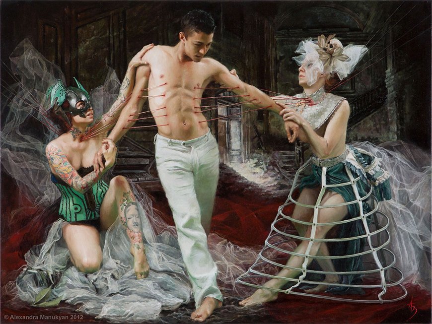
Putting the book to one side for now, I had a good look at Shawn’s other artwork because he produces work that is quite different from what is in the book. My reason for including other work is pretty simple — It’s to show he is capable of creating work that has more of an atmosphere, and may even be a style that is more conducive to showing complexity. I am also aware it’s been a decade since he began the series on mental health, and I’m curious as to whether he’s grown as an artist.
2019
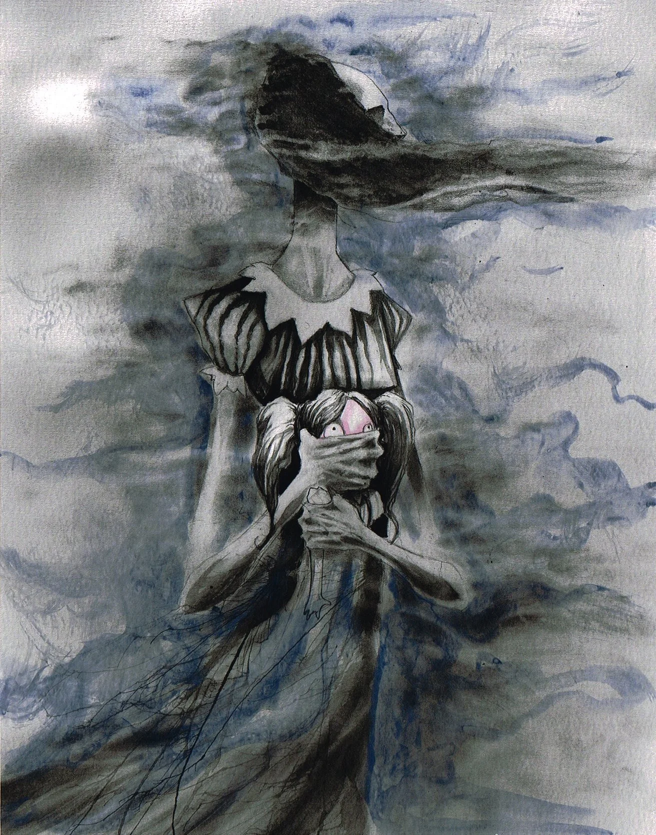
The artwork showing the female holding the face of a young girl is one of Shawn’s pictures that I liked because it shows a good amount of detail and seems to capture a moment much better than the artwork in the book. While I like the image, there is a certain amount of ambiguity as to what is actually going on here. But, this can often help, not hinder, because it can lead to various interpretations depending on who is looking at the image and what’s going on for them internally. The older figure is looking off to her left — is she alert to some kind of danger, or is she keeping an eye out so that she doesn’t get caught? The young girl looks frightened, but is she scared because she fears harm from the woman, or is she scared because she knows she’s being silenced so as not to draw attention from a bigger threat? Are we looking at two stages of development within the same person? Or are they two different characters altogether? Is an adult woman holding her inner child hostage and refusing to give her a voice? Or does it describe an old mother wound where someone had her self-expression stifled by her mother? There is movement in the image, and this could be wind (thoughts) or water shown by the blue (emotion), or maybe it’s both? We also have the energy going in two different directions because the bottom of her dress is going one way, and her hair another. Is this indicative of something working at cross-purposes? There was no title to the image, and I find that quite interesting, considering Shawn’s proclivity towards telling us what we should be seeing. My point here is that he is clearly capable of showing something complex and ambiguous, and this style may have worked much better for describing mental health conditions.
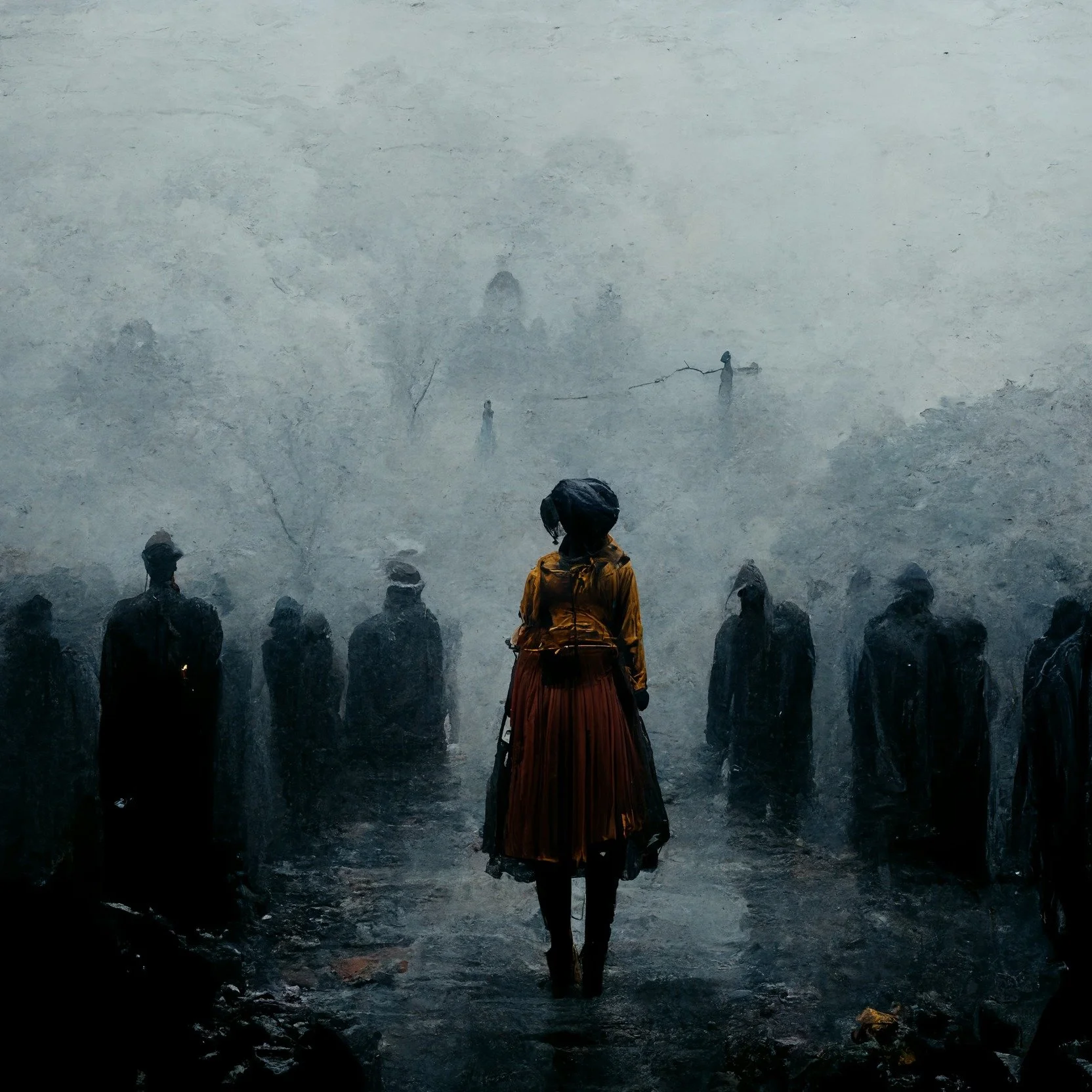
She has never felt more alone than in a crowd (2022)
The final image is the most recent of this bunch, and I think I like it the most. Shawn stated that he’d been playing around with AI to create this picture, but I think he’s done a really good job of creating something with a strong overall vibe. I can’t quite make out if the female figure is facing forward or backwards, though, — the bottom legs look like she’s heading away from the viewer, but the rest of her seems to be forward-facing. I like that she has some colour because it gives good contrast to the figures in grey. The yellow top and red/dark orange of the skirt suggest lifeforce and energy, and I think this is especially relevant considering the rest of the image looks like something from the underworld. It’s definitely creepy, but also hopeful because of her colourful garb. The title is a bit of a misnomer because while loneliness can be understood from the image, it’s a good thing not to blend in with such a background or crowd. She looks the most human out of all the figures in the image. Like the previous image, it’s wonderfully atmospheric and ambiguous, and I can really enjoy it for what it is. It has depth and complexity, and likely more than one interpretation depending on who is looking at the artwork. It’s just so much more interesting to look at, and more importantly, we have an actual scene — it’s not some discarnate entity taken outside of any context or meaning. I really do like this picture.
I often feel that if someone has to tell you what the art is doing, it's probably not doing it very well. In some ways, it’s like when you write fiction, you’re supposed to show, not tell. There’s too much telling going on here. An enormous part of the problem for me is that the entire project is too binary. Literally, too binary. It’s dark and light, or black and white, if you like, and very little else in the artwork or the interpretations Coss gives along the way. It’s too simplified, and for that reason alone, I can’t take the work seriously. He states that he made the condition humanoid rather than depicting a person with the illness, but that whole idea just sounds incoherent to me.
It is what it is, and I have no criticism of it being a consumerist product. For the superficial and glib, it’s likely an excellent coffee table book. Sincerely, I do like some of Shawn’s art, and while my attitude towards the book is pretty grim, my main gripe is the marketing. I don’t think it does what it says on the tin, and I honestly don’t care that it has thousands of positive reviews.
For those who are serious about self-development, this book isn’t going to be of much use. Quite honestly, if I saw this in a therapist’s office, I’d be out of there like a shot. I have to wonder if it was a mistake to use the same medium and genre to describe such an enormous range of conditions. Or maybe the problem is that he’s tried to isolate the condition from the person? I mean, you just can’t — The mind and body are not separate, and you can’t assess mental illness without looking at context and environment.
Anyway, dear daughter, I agree. By all means, hurl it from the balcony once I hand it back!
Links:
Shawn Coss on Facebook
Recent Posts


Categories
Tags
- Bird 10
- Water 6
- Rock 5
- Endings 4
- Window 4
- Boat 3
- Bones 3
- Clouds 3
- Art as Therapy 2
- Bandages 2
- Cards 2
- Chessboard 2
- Death 2
- Kraken 2
- Mask 2
- Puddles 2
- Rain 2
- Umbrella 2
- Veil 2
- Balloon 1
- Bed 1
- Birdcage 1
- Blindfold 1
- Books 1
- Box 1
- Bridge 1
- Bubble 1
- Buddha 1
- Caught 1
- Chair 1
- Chess 1
- Clock 1
- Cobwebs 1
- Cogs 1
- Cone Head 1
- Crown 1
- Desert 1
- Dice 1
- Distance 1
- Dreamcatcher 1
- Dreams 1
- Egg 1
- Face 1
- Fly 1
- Gramophone 1
- Grief 1
- Hair 1
- Halo 1
- Hammer 1
- Hollow Man 1