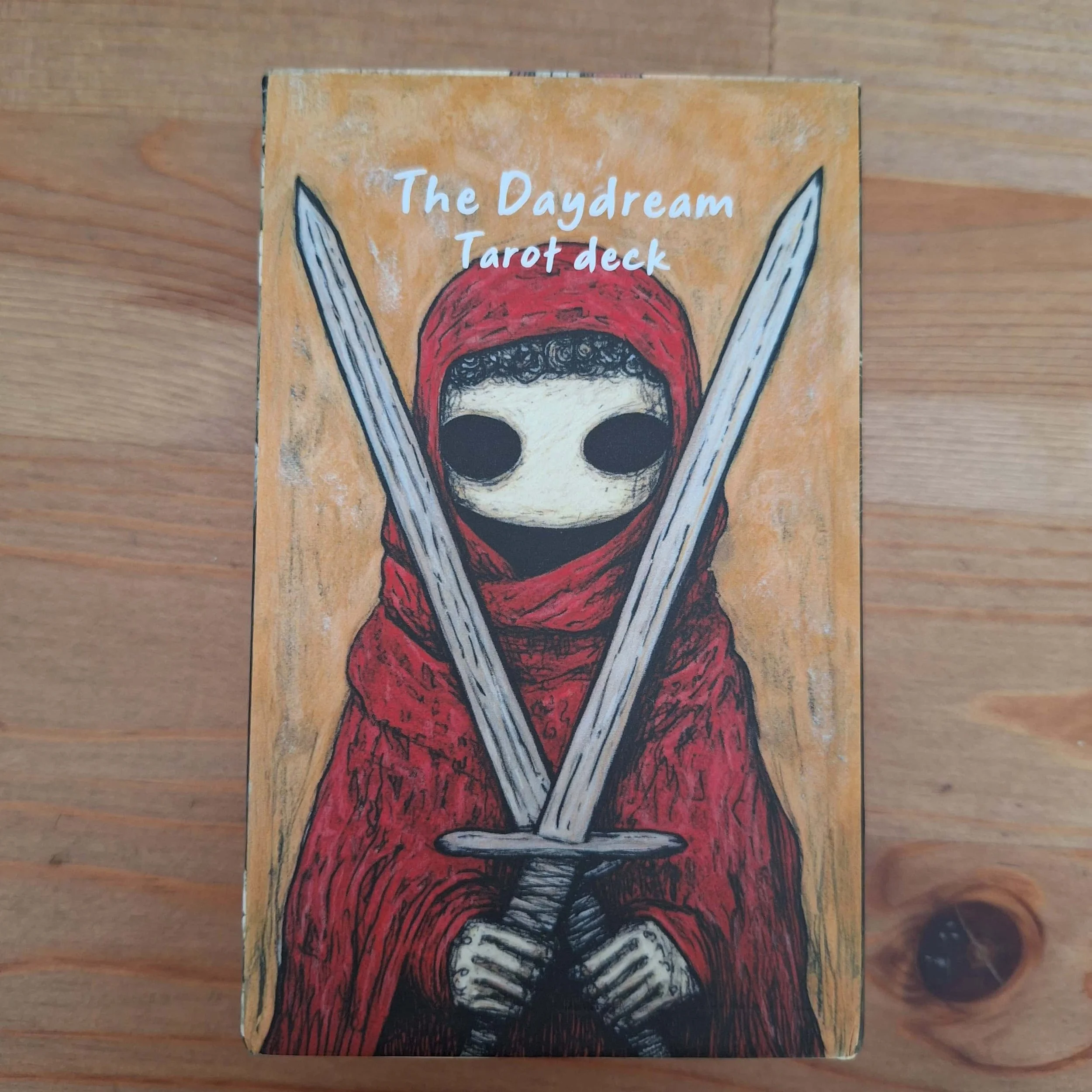
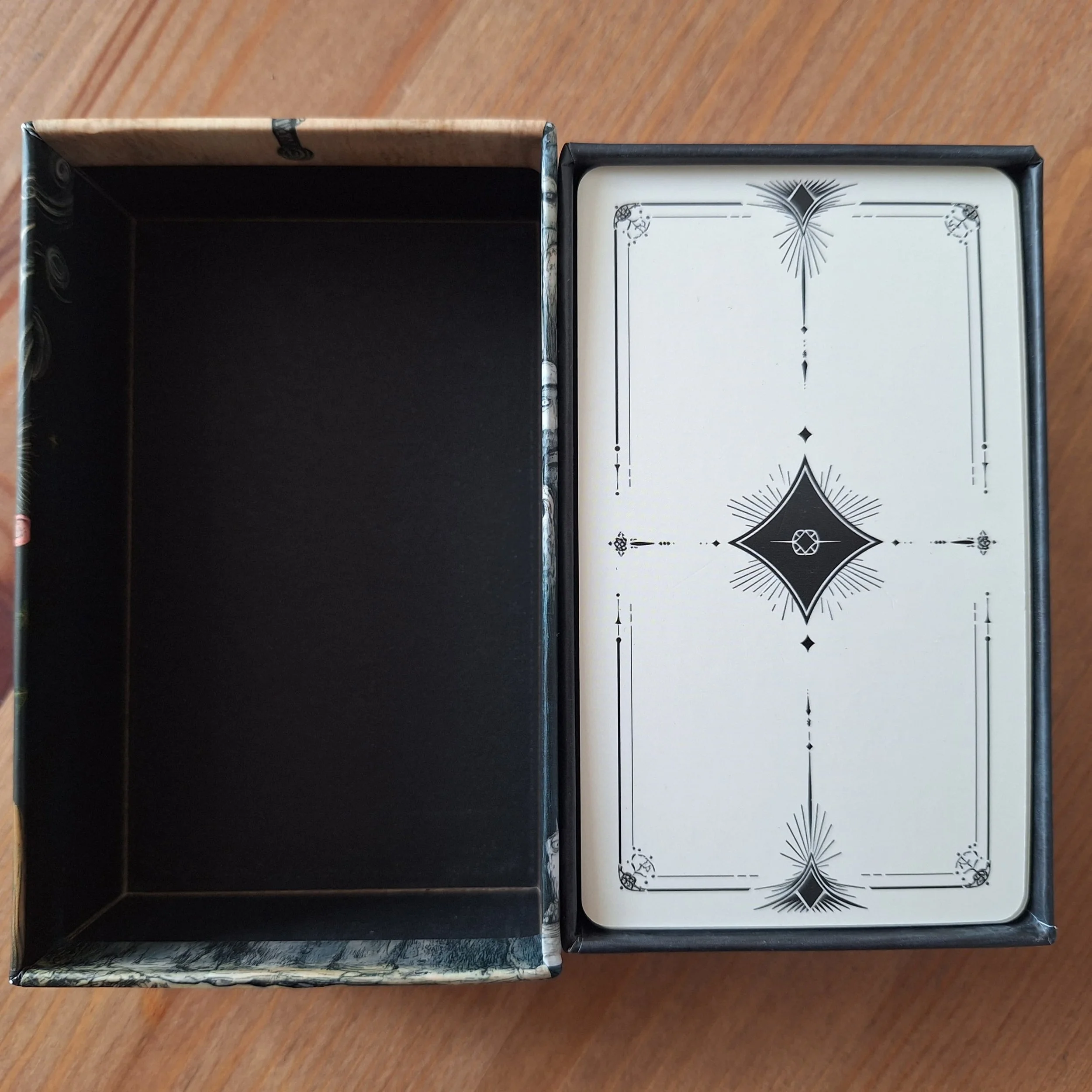
The Daydream Tarot Deck was an impulse purchase after seeing it on a reader’s YouTube channel. I fell down a rabbit hole with this one, and you may need to bear with me a minute. I bought it from Amazon for £20.59 from Jrskvaro, but it is available for £16.99 from another seller. There was no artist listed, and no ISBN or publishing info. I found out that it’s an AI-generated deck that began life as a digital download, which is available for sale on Etsy for £9.36. The deck arrived in a sturdy box, but there is no guidebook. The cards are reasonably thick with a laminate finish.
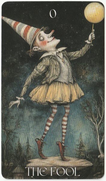
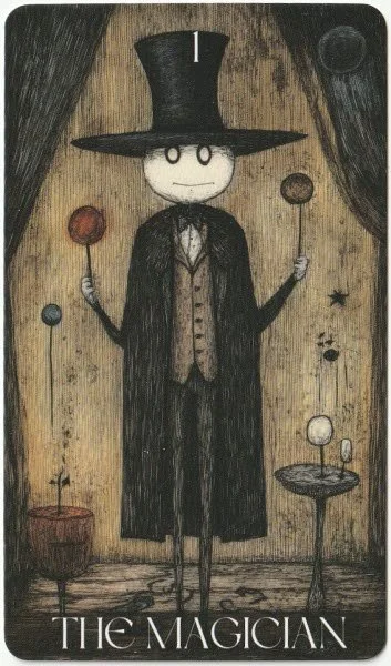
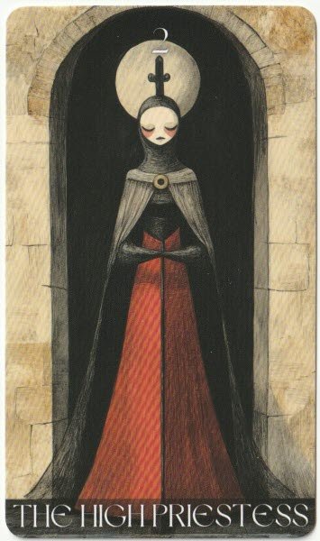
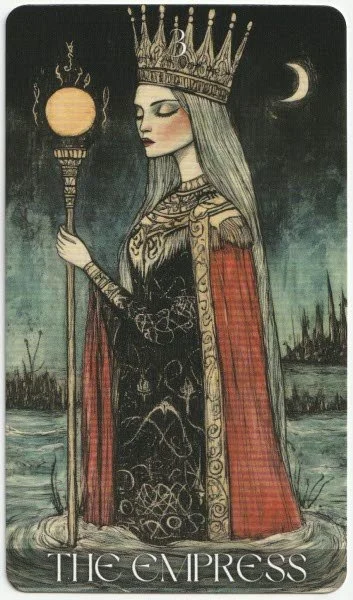
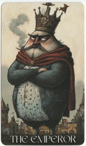
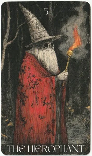
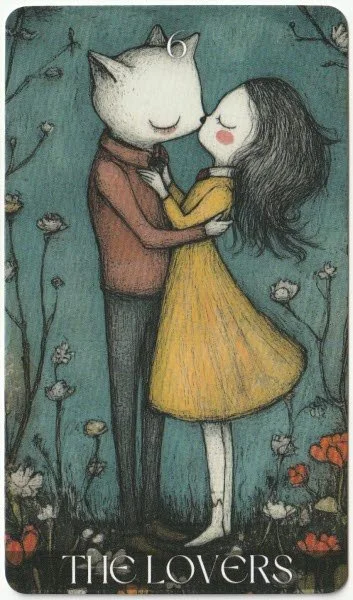
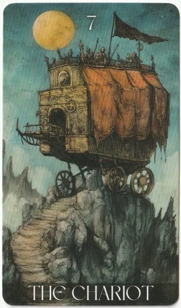
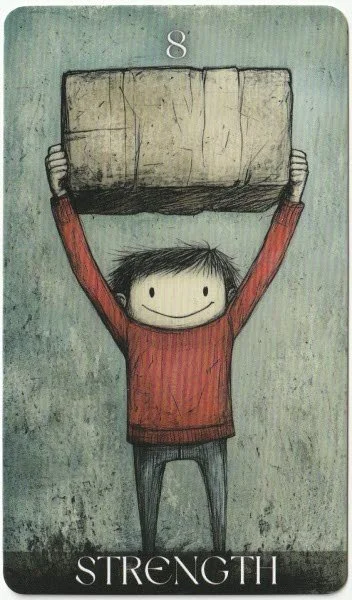
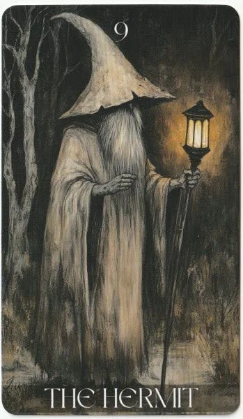
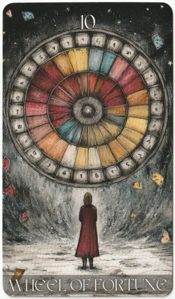
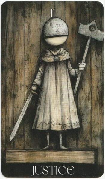
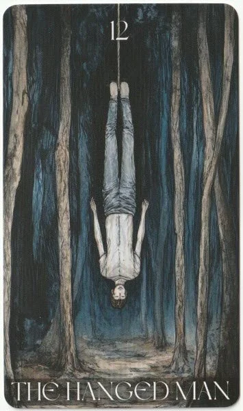
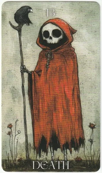
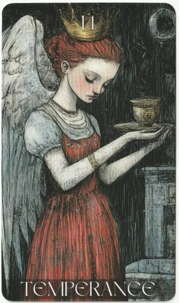
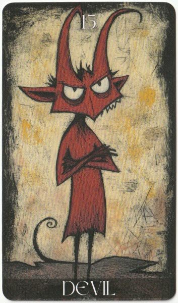
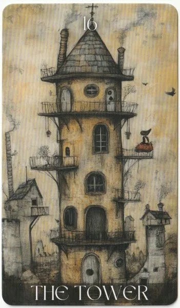
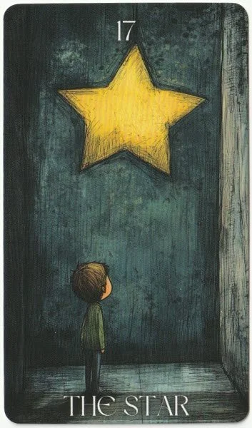
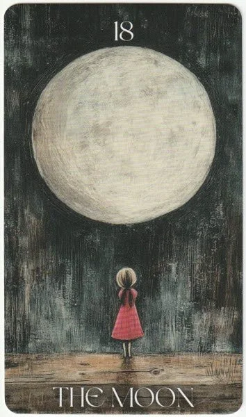
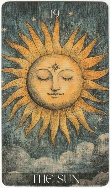
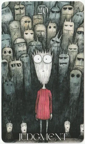
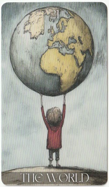
The major arcana are heavily illustrated and are a mix of traditional poses and reinterpretations. Within the first six cards, I can see six different artistic styles, but because the colour palette is consistent, it may not be easily noticed. Individually, the cards are fine, although I shall deal with The Hierophant in more detail shortly. When looking at them side-by-side, it becomes clear that it isn’t just stylistic differences; it’s like they’re different genres of art. The Fool is similar to classic children’s book illustration. The Magician is more folk-ish and has a completely different facial style. The High Priestess has sharper edges and is slightly darker in vibe, but it at least keeps the symbolism of the moon. The Empress is a far more ornate style, and almost akin to fantasy without the underlying sense of realism. The Emperor is almost satirical and cartoon-like. And finally, The Hierophant has a dark ink illustration of a wizard in a style that is typically found in occult-leaning fantasy, and if the card weren’t named and numbered, I’d assume he was The Hermit. Moving through the rest of the cards, I can see further style fragmentation in cards such as The Lovers and The Wheel of Fortune. I find The Hanged Man at odds with the rest of the deck because it’s such a big shift away from the whimsy of the previous cards. Death, The Devil, and The Tower are all different in style again. Oddly, The Star, The Moon, Judgment, and The World all appear to be of the same deck — which kind of shows that artistic consistency is possible. The Sun stands as an outlier and is possibly the closest to a traditional rendering.
The Hierophant and The Hermit look ridiculous side by side because they are almost identical, and it makes me question how much the creator knows about tarot. I have to wonder whether they put the same prompt into the A.I. and didn’t bother, or care enough, to notice the visual similarities. In a reading, they have very separate meanings — The Hierophant as giver of wisdom has a different purpose from that of The Hermit as seeker of wisdom.
I mean, look at them! Honestly, as standalone images, there isn’t anything wrong with either. The problem is that this is the major arcana in a tarot deck. Images are meant to convey something very specific because the set, in its entirety, is a complete system. I know that some people read playing cards, and that is fine, but the whole point of a decorated tarot deck is the artwork. If we have to rely on names and numbers, the artwork isn’t doing what it’s supposed to be doing.
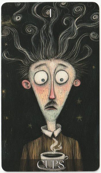
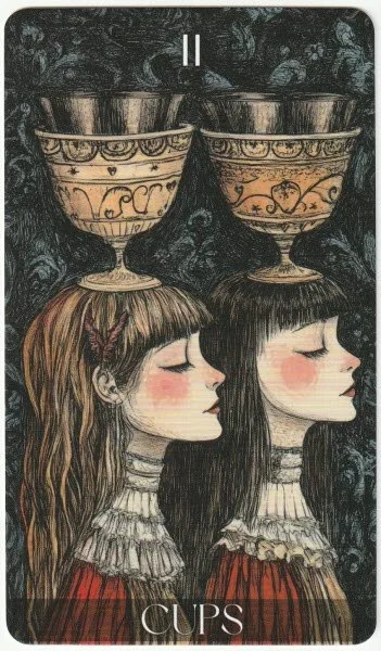
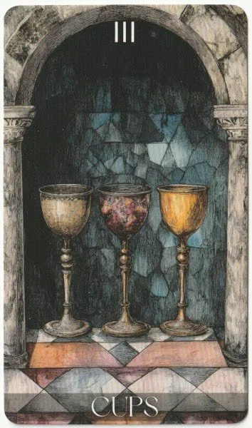
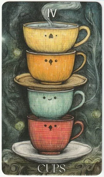
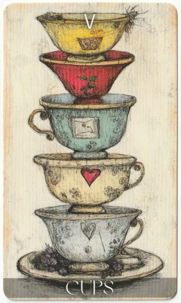
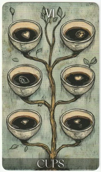
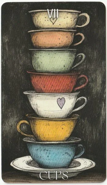
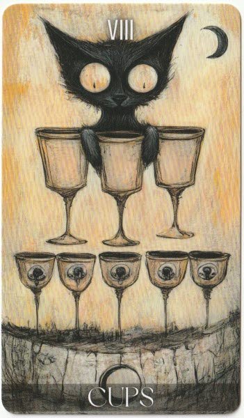
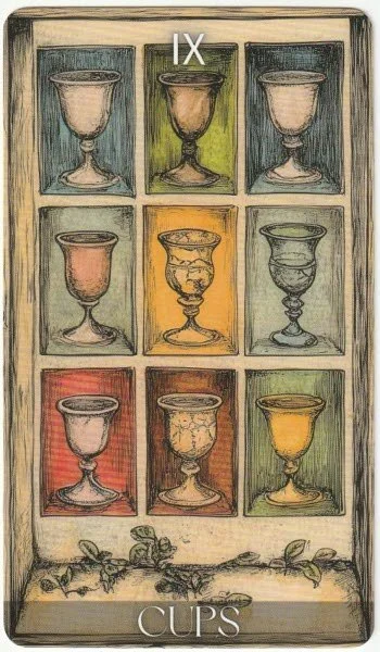
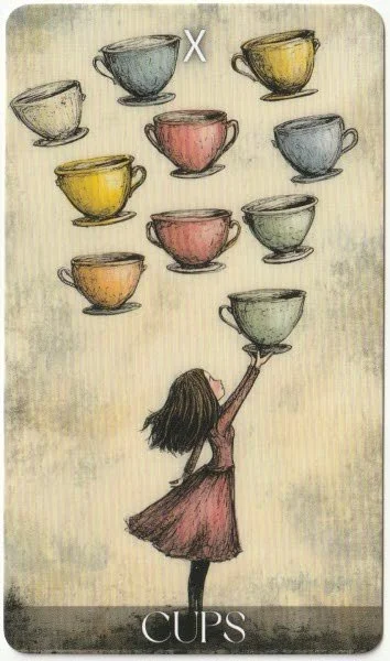
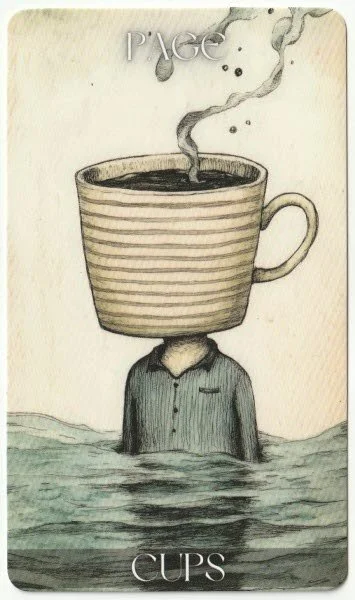
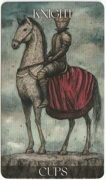
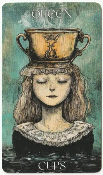
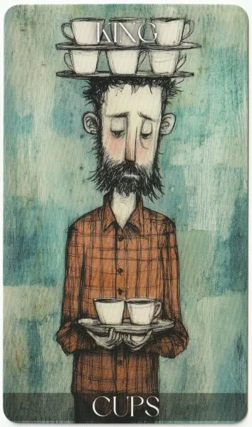
The suit of cups is a mixed bag. The Ace of Cups is in a similar art style to the Judgment card, and yet I can see the same lack of art-style cohesion across the cups as I did in the major arcana. There is an additional split in the pip cards with the Ace, Two, Eight, and Ten showing a more creative scene, and the rest are simply the appropriate number of cups. Further, the cups are not the same style across the cards. The court cards further exacerbate the lack of unity because they don’t look like they’re from the same family. The King actually looks like he could be a replacement for the Eight of Cups. In fact, other than a startled-looking face for the Ace of Cups, he’s the only one to be showing any emotion at all. The Cups often have some of my favourite cards, but this is not the case here. I’m struggling with the lack of visible emotion in the cards — which can be displayed through the overall atmosphere, or the posture of a figure, or several other ways. I am also struggling with the mixing of goblets and mugs. Once again, none of the artwork is bad in and of itself; it’s just not doing what it needs to do for the overall project.
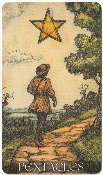
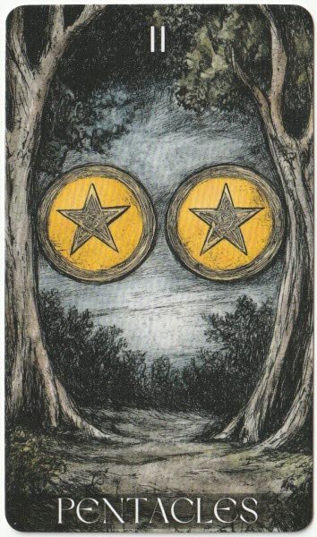
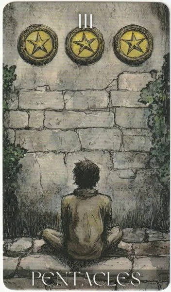
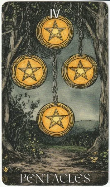
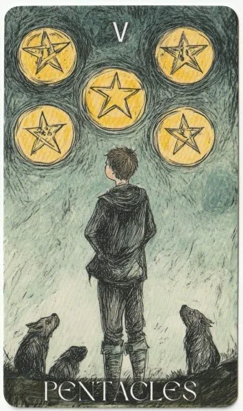
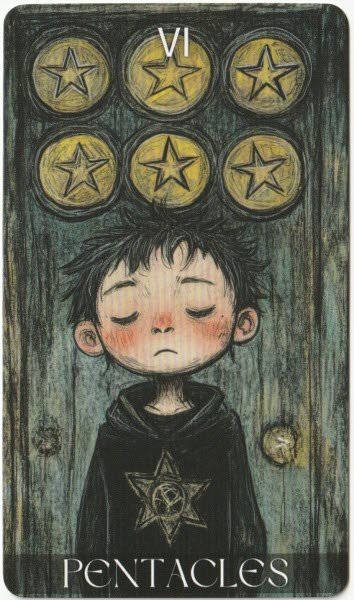
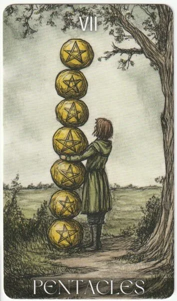
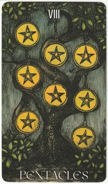
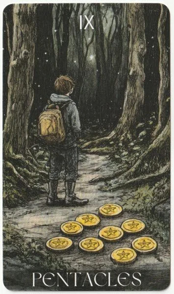
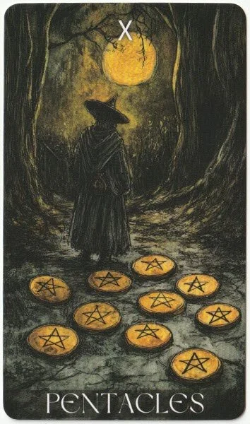
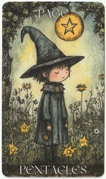
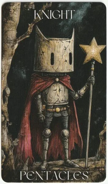
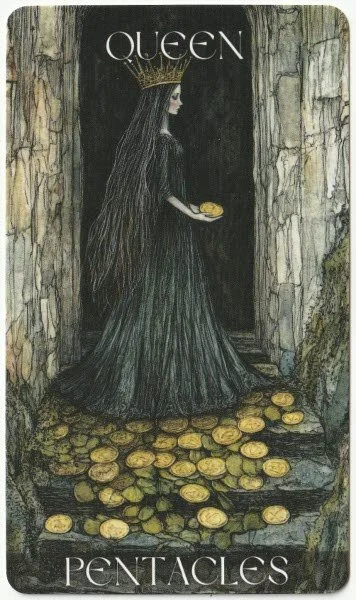
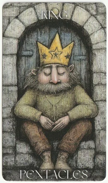
The Pentacles show one of the clearest indicators of being connected to the Rider-Waite, with the pentacle being the obvious hook. The Ace in particular carries a pseudo-traditional theme, but this stands in contrast to much of the major arcana. I like that the image shows a man on a path because it is easy to read that he’s on a journey. The pip cards are more cohesive here than in the cups, but many of the cards don’t give much of an indicator as to the symbolic meaning in the visual cues. The Nine and Ten are an interesting pair because they both show the same scene, but the Nine has a younger person about to enter a forest with the pentacles to the side of him. The Ten shows a person who is clearly older, and this time the pentacles are directly behind him. Yet again, the court cards don’t look like they belong to the same family. The Page and Knight are childlike in the overall illustration, as well as the figures themselves. The Queen and King are both different again — the Queen is far more serious and grown up compared to the soft roundedness of the King.
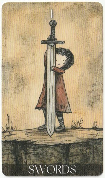
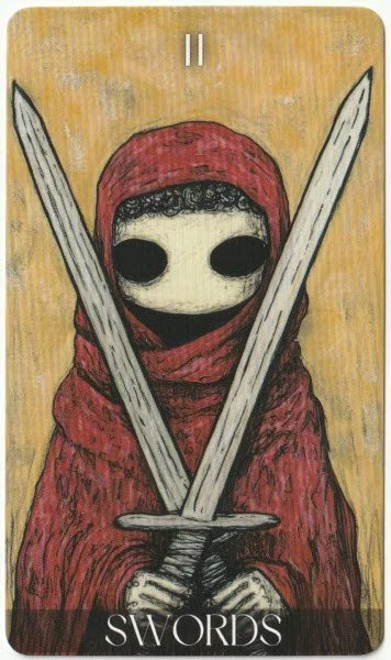
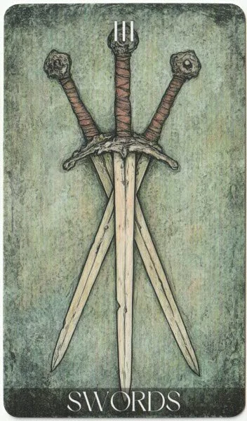
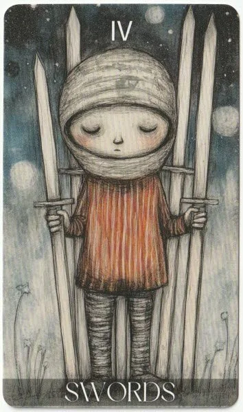
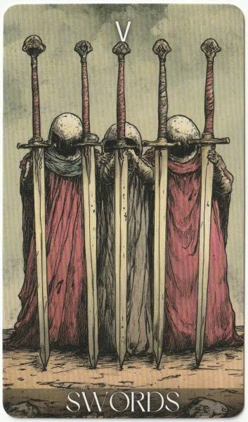
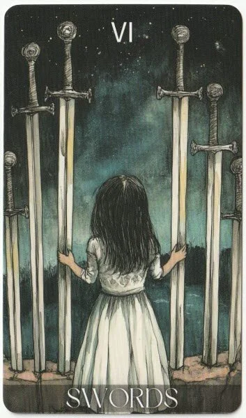
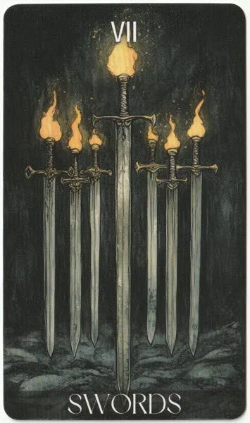
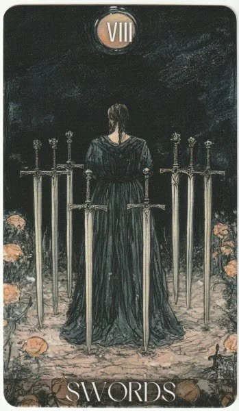
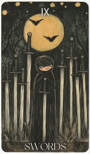
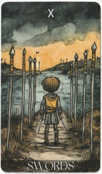
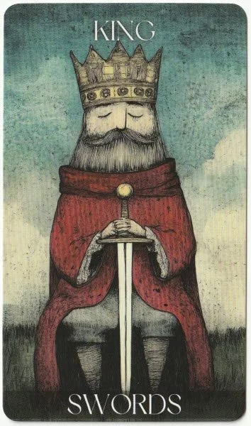
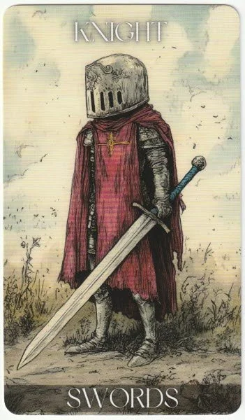
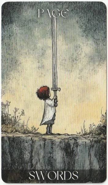
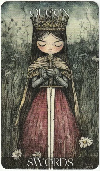
I normally prefer the Swords in a deck, so this suit is probably the biggest disappointment for me because I usually rely on the Three and Eight in particular to judge a deck on its overall sensibility. The pips are mostly decorative, and the Two of Swords stands apart from the rest of the suit with its cloaked figure, with nothing more than hollow spaces for the eyes. The Three of Swords is about as plain and boring as can be. There is no sign of heartbreak, or separation, or anything else. It is actually one of the dullest cards in the suit, which is ironic considering the weight the card carries symbolically. The Five of Swords is a pretty good depiction of surrender, considering the swords are upright and not on the floor. This card in particular is giving me Misha Gordin vibes because he often stripped down his human subjects into faceless figures holding identical objects arranged into tight rows. It gave the effect of flattening individual identity into a pattern, which lends the image real dramatic weight. The Six of Swords lacks the movement usually seen in the card because the girl is standing still and holding onto the upright swords that are pierced into the ground. The Eight of Swords, my other go-to card, is another boring representation that shows the back of a woman with swords to either side and behind her. I am so disappointed because there is no real sense of mental torment. But I do quite like the Ten of Swords because it shows a young child with swords on either side of him defining the pathway, and he’s clearly at the end of a road. The court cards are also much better because the Queen and King look like a natural pairing, and the entire lot looks like they’re from the same family.
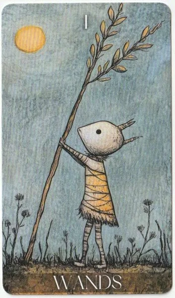
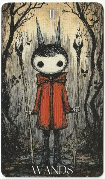
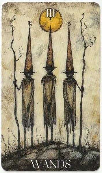
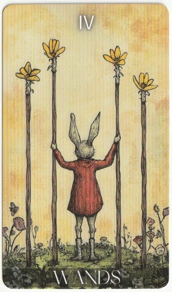
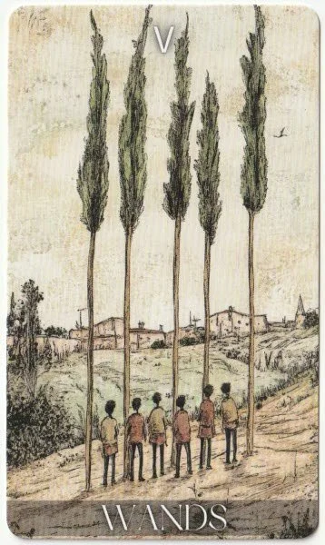
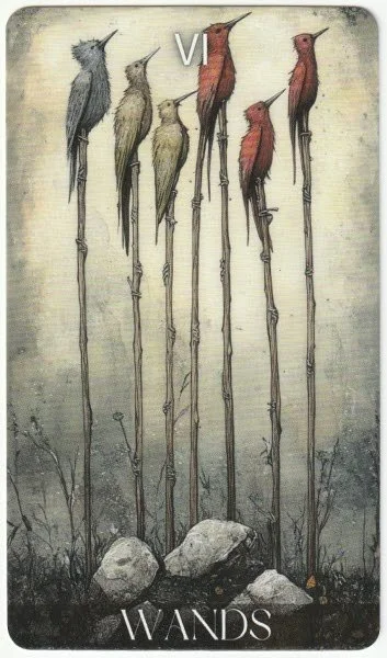
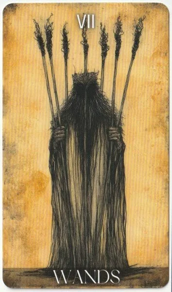
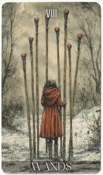
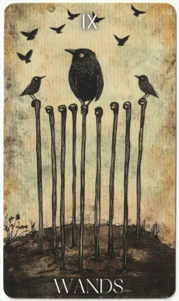
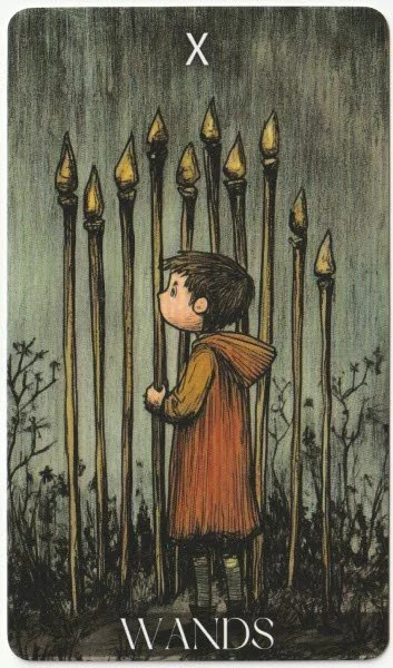
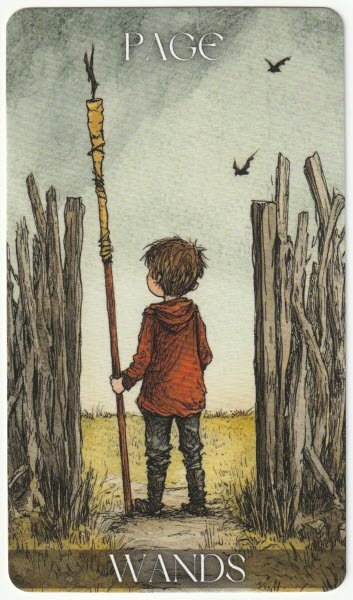
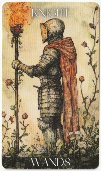
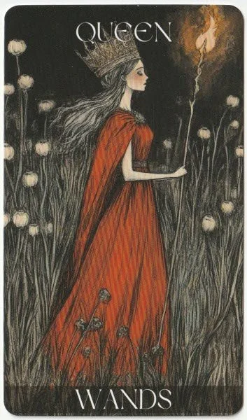
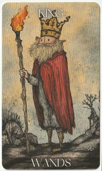
There are some sweet cards in the suit of Wands, and overall, the suit is possibly the most cohesive in style and palette. The Ace and the Four seem a little out of place because the figures are so different to the human-like characters in the rest of the cards. Each of the pip cards has its own scene, and while I welcome this, they’re not exactly easy to read symbolically. Most of the cards show wands, but only half have any sign of fire. I like a lot of the cards as images, such as the slender figures in the Three of Wands, and the birds in the Six, but I can’t really see anything meaningful in the pip cards that directly relate to tarot meanings. Like the swords, the court cards all look related, and the Queen and King look well-suited when placed side-by-side. I do quite like the artwork; it really is the lack of symbolic meaning that lets it down. Like the rest of the deck, many of the images are good as standalone pieces of work, but it doesn’t feel like the creator has any real sense of what tarot is nor what it’s supposed to do.
I am aware I haven’t been particularly thorough with any of the cards. It was definitely a conscious choice not to give the deck too much time when I could see early on that it wasn’t doing what it needed to do. Digging further into its origins, the Etsy shop owner of Mighty Bundles claims to be living in Wyoming, USA, but the phone number attached to their store policy gives an area code for Turkey. The store also stocks several deck designs and sells other downloadable collections for t-shirt designs and wall art. I have mentioned before that I don’t really have a problem with AI, but looking across the Etsy store, I felt uneasy and also found it all a bit cringe.
I admit that my curiosity had got the better of me not long after I began the review, and I wanted to see how many piles of different art styles I would end up with, and whether there was a pattern to what I was sensing. I anticipated more than a dozen distinct styles of drawing and actually found fifteen across the major arcana. Further fragmentation in the pip cards shows a distinct lack of symmetry in whether the pips were left plain or decorated with their own scene. It is certainly not uncommon to find artists are stronger on one or two suits, but the artwork is always consistent in style and tone. I have to wonder if most of my unease with the deck is the lack of visible pattern, and it is too easy for me to assume that this likely stems from a lack of conscious direction. It’s one thing to use A.I. to create a project, but the output is only ever going to be as good as the commands that generate the content.
On their own, the artwork in the cards is nice to look at. But in its entirety, this deck fails as a deck for me. I find the lack of cohesion too jarring to even think about working with it — it’s just too much of a distraction. The lack of symbolism is a major factor, and this is something that could’ve saved the deck from being almost useless. I could borderline cope with a fragmented-looking deck if the symbolism was rich, but it just isn’t. There’s a lack of depth to many of the cards, but this is hardly surprising if the A.I. prompter had no real idea about what they were doing. The seller has other files available, although I have no plans to indulge my curiosity and buy more of their work to see if they all have the same problem.
I will soon be launching deck giveaways of the decks I shall not be keeping, and this will certainly be in the pile. I plan to draw winners on the major solstice points of the year, although I haven’t quite figured out the mechanics yet. I will keep you all posted.
Recent Posts





Archives
Categories
- AI Decks
- Animal-centred
- Books
- Decks For Self-development
- Difficult Decks
- Expensive Decks
- Lenormand Decks
- Oracle Cards
- Oracle Cards For Beginners
- Out-of-print
- Personal Favourites
- Published 2000s
- Published 2010s
- Published 2020s
- Tarot
- Tarot & Oracle Sets
- Tarot Cards For Beginners
- Under £15
- Under £20
- Under £30
- Under £40
- Witchy Decks
- Woman-centred

Details for the tarot and oracle giveaway for September 2026.