Trionfi Della Luna Tarot
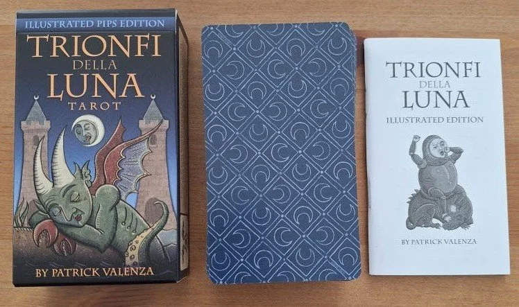
I feel relieved to be back on solid ground, and while this may be an older deck, it’s pretty timeless because the work is original and it’s not trying to be trendy. I worked with another of Patrick’s decks, the Deviant Moon Tarot, for the best part of a decade until the cards were so worn they were falling apart. Despite their quirky appearance, they worked well for general readings, so I am hoping this deck will be of the same calibre. The Trionfi Della Luna Tarot began life as a majors-only self-published deck back in 2014. He expanded the deck in 2016; although initially, only the majors and court cards were illustrated, the pips were not. The deck has had many subsequent incarnations, and the edition this post refers to was published by U.S. Games in 2025, which was some time after Patrick introduced the fully illustrated pip cards in 2022. He somehow managed to create the Deviant Moon with photographs, although I have absolutely no idea of the actual process. This deck was drawn by hand, and I like the overall result. While different to the DM, you can see it’s his work — the split faces and oddly shaped bodies are visibly related to his earlier work. The deck comes in a sturdier version of a tuck box, and there’s a chunky little white booklet that gives a brief card description and upright and reversed meanings. The cardstock is good; not flimsy nor too thick, and it’s lightly laminated. I managed to pick it up on sale for under £12, which feels like a bargain!
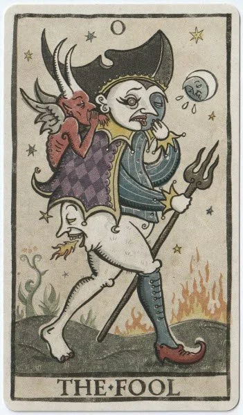
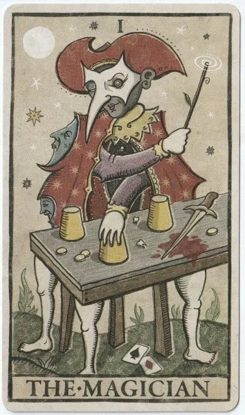
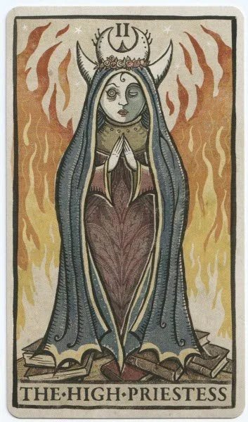
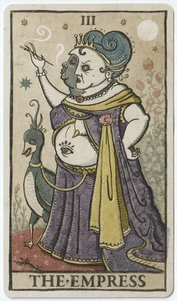
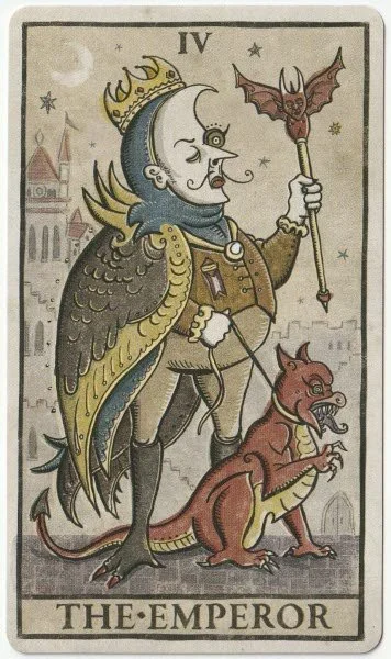
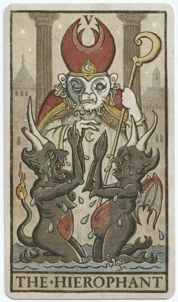
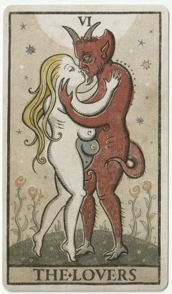
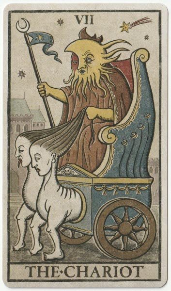
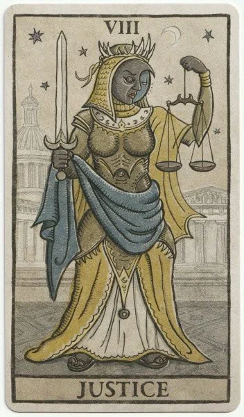
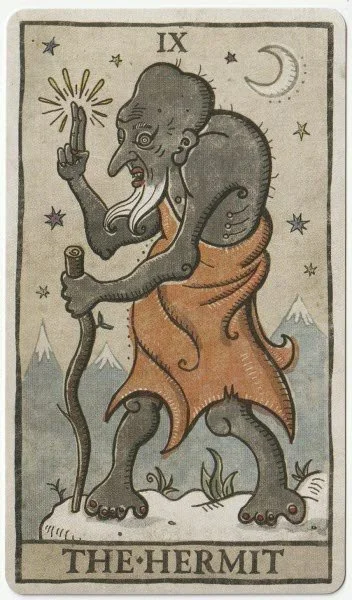
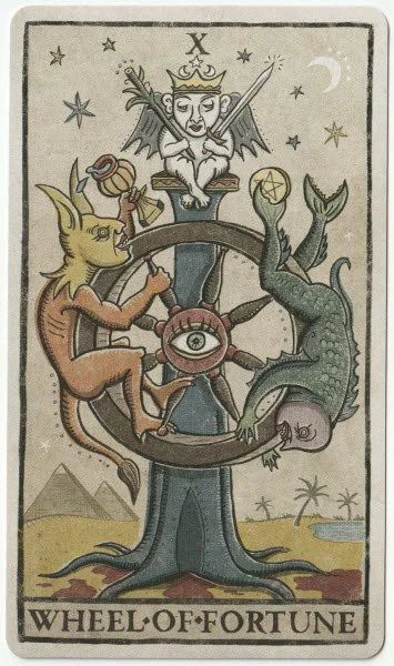
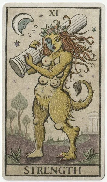
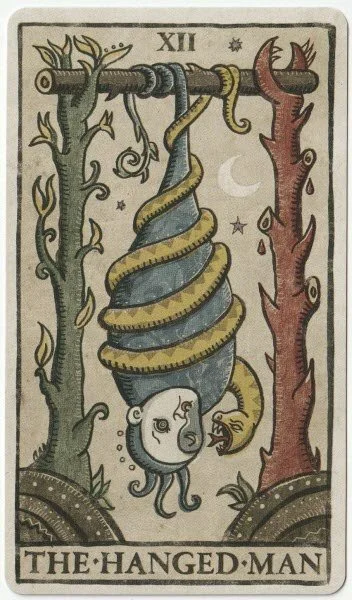
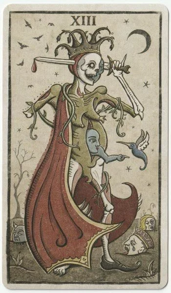
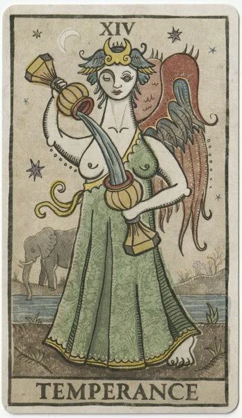
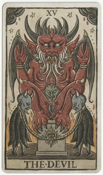
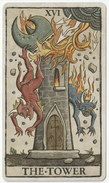
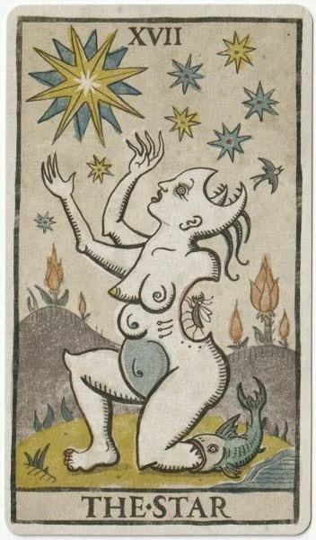
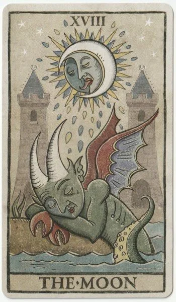
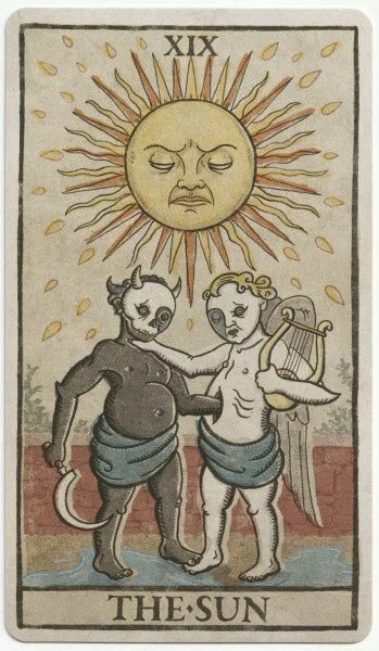
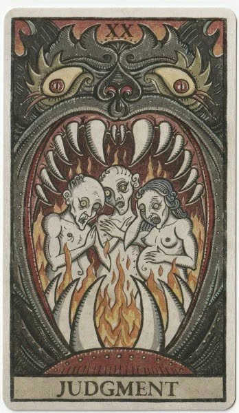
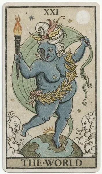
The major arcana are all numbered and have their traditional titles, which is helpful if you’re a beginner. The artwork is a curious blend of influences; it’s relatively easy to categorise it as Grotesque, but I can also see Greco-Roman elements, and it has an almost folkloric theme with hints of the old woodcut style. Patrick wastes no time showing his humour with The Fool, and I am definitely curious as to whether the artwork will ever be a direct reference to someone who can talk out of their arse. The LWB mentions the demon whispering temptation into the figure’s ear, but sadly, there is no mention of the fire-breathing face in place of a backside. I quite like The High Priestess and find the card to be almost soothing despite the presence of the fire behind her. I like the blend of religious overtones with the nun’s habit and the neo-Pagan crescent moon on her head — the cow horns may be Egyptian, or they may not be cow horns at all, and some other type of headpiece. For me, they’re cow horns! The Emperor’s pet dragon-dog is a marvellous addition and speaks of the energy and ferocity of temperament indicated by this card. He looks pompous, and he is sporting elements of the dragon himself with his feet and winged back. While I generally like The Hierophant as a card, this version makes me feel slightly uneasy. I think the reason for that is that it portrays repentance or forgiveness through the way the two demonic creatures are posing in front of the Hierophant, who looks very much like a traditional religious figurehead. The LWB says, “The Hierophant presides as a moral pillar in a spiritually corrupt society; or so it is believed. Kneeling before him, two pertinent demons beg for forgiveness as the tears they shed begin to flood the street. Upright Meaning: Tradition. Rigid beliefs. Doing things by the book. Unquestionably accepting societal norms. A mentor or role model. The need for guidance. Reversed meaning: Defying tradition. Unconformity. Questioning the accepted truth. Self-guidance.” So, it’s clearly a card that demands discernment when it turns up in a reading, and although it makes me feel uneasy, I can appreciate why Patrick would interpret it in this manner. The Lovers is another card that appears to suggest a need for caution, with the demon holding a young woman in an embrace. Will this theme repeat throughout the deck? The Chariot is a bizarre-looking card with human-faced horses and a charioteer using their hair for reins. I like how it emphasises the need to control the self but also a warning against others leading you around. I find the details in The Hanged Man quite interesting, and I like how a snake is coiling around the man. The LWB stresses that fear and excuses are a factor, and directs the reader towards taking responsibility for the lack of movement. Often, decks will put the focus on having to look at something from a different viewpoint, which is fine, but I think the passivity of the person who pulls the card is generally overlooked in favour of spiritualising apparent delays.
One of my favourite cards in the Deviant Moon was The Moon, and I like what Patrick has done here because he’s given the unconscious a double-dose of weight by showing the moon and a sea-creature. The LWB says, “A sea-demon rests his head on the shore in a peaceful slumber. Half in and half out of the water, he is in a twilight state of consciousness. Meanwhile, the moon overhead influences the demon’s dreams with wild intensity. Upright Meaning: Intuition. Illusions. Subconscious thought. Subliminal messages. Dreams. Manipulation. Deception. Reversed Meaning: Suppressed feelings. Secrets coming to the surface. Internal confusion. Waking up to reality.” I love that nothing is clear-cut in the interpretation and that there’s good and bad in both positions.
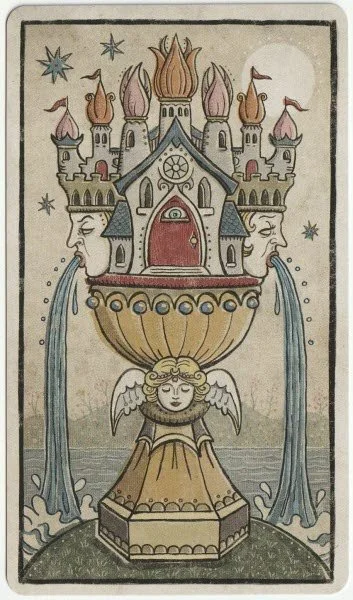
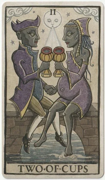
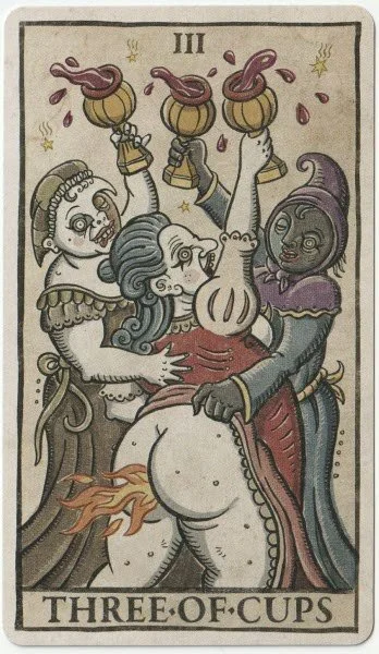
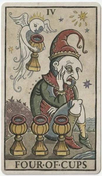
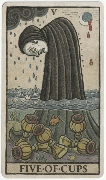
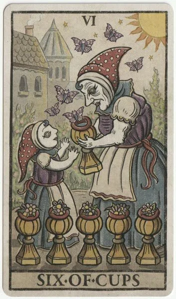
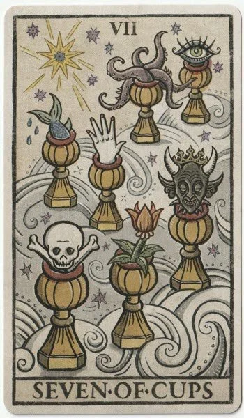
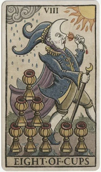
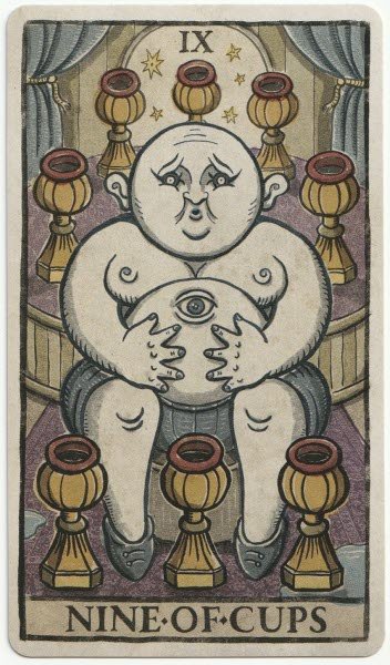
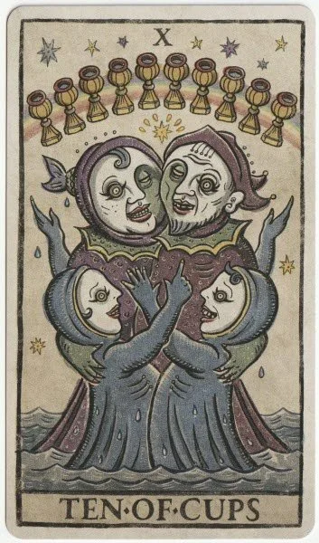
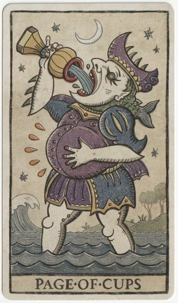
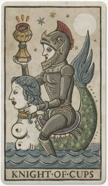
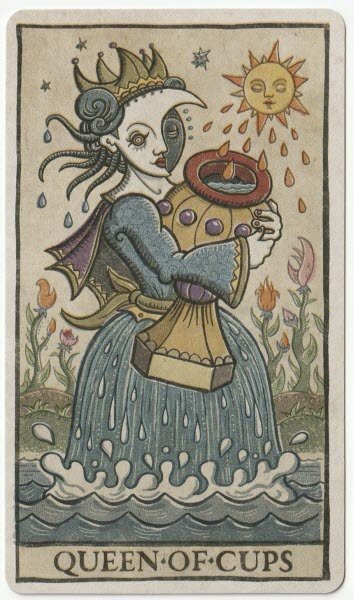
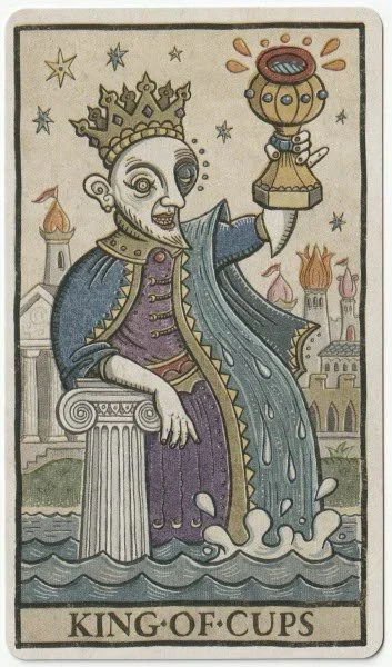
The cups are a strong suit — I actually like every single card. I’m very much drawn to the artwork in the Two of Cups. It’s saying an awful lot here, because we have the similarly looking couple sitting in the middle of a bridge, and we can see the moon’s breath reaching the cups they are holding. Symbolically, it’s wonderfully rich, and I’m leaning into the suggestion that unconscious impulses are also in play irrespective of any physical attraction. They look well-suited, and the only caution I can see is that she has her bare toes clearly in the water, while he still has his shoes on. We have the return of the fiery arse in the Three of Cups, and I’m wondering if he’s a relative of The Fool. The sad-looking jester in the Four of Cups evokes some sympathy — he’s so forlorn he doesn’t realise there is very obviously an angel right behind him who is trying to offer him a cup. I love the sadness shown in the Five of Cups, and I like that the LWB points out he can retrieve the cups if he wants or needs to. The Six of Cups shows an incredibly sweet scene between a grandmother and child. It’s a completely different vibe to the rest of the deck, which helps it to stand out further. It does the job of evoking childhood memories while bringing the past, present, and future into one image. What I am liking about the deck so far is how Patrick is making the messages explicit, and this continues in the Seven of Cups with visible differences in the available choices. I like the symbols he’s chosen, and we have a good selection of bad and marginally better, but there are also hints as to what might be going on underneath. The Eight of Cups departs a little from common interpretations because the man appears to be walking straight past rather than away from the cups. But it’s the Page of Cups who grabs my attention with his fat, swollen belly and his exaggerated swigging from the cup he’s holding. It makes me wonder if it could be an indication that any potential suitors may be more invested in taking rather than giving, or even sharing. All of the court cards are lovely, and the King and Queen look like a good match. They are not looking at one another when the cards are side by side, but they are at least facing in the same direction. I like that both of them have their feet fully submerged in the water and both look happy. The King is raising his cup as if to toast those around him. The LWB says, “The joyous king holds his golden chalice high, toasting the wellness of his kingdom. His watery cloak flows smoothly into the sea, illustrating his free and easy-going temperament. Upright Meaning: A compassionate figure. A calm and caring personality. Emotional wisdom and maturity. Overflowing generosity and kindness. Reversed Meaning: Emotional immaturity. Creative frustration. A moody person. Volatility. A self-serving individual.” One comment I do want to make here is that if you don’t work with reversals, another way is to work with the cards in pairs, and if it appears with a good card, interpret it upright. If it’s paired with a bad card, read it as reversed. I rarely work with reversals, and prefer to read them in pairs — rather than laying two cards at the same time, do your regular layout and then go around again.
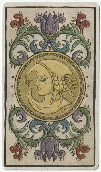
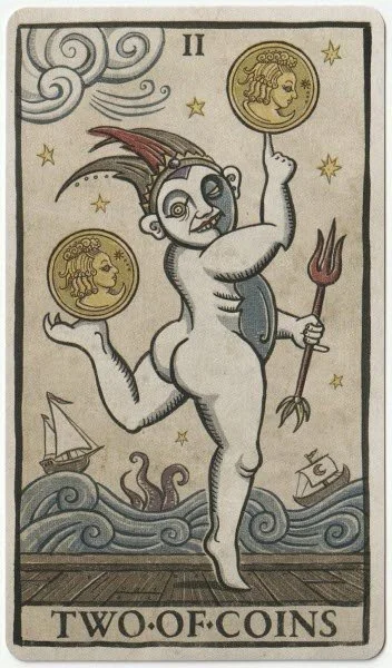
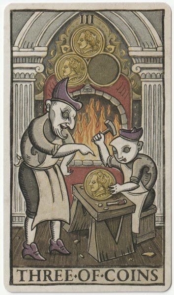

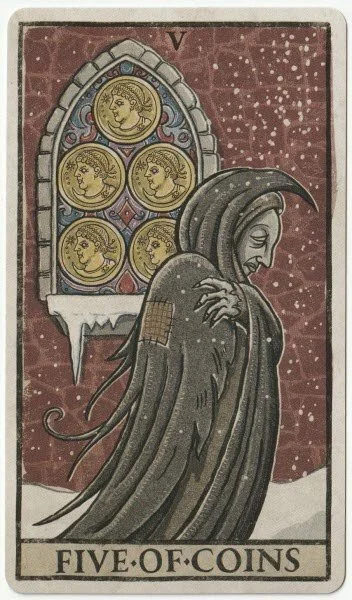
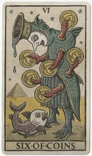
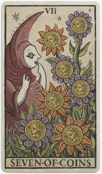
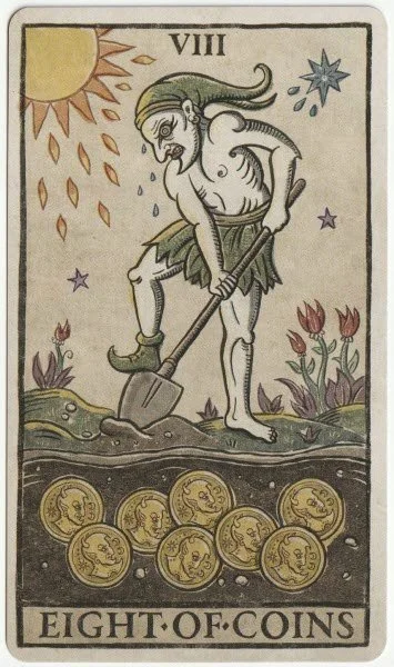
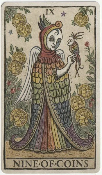
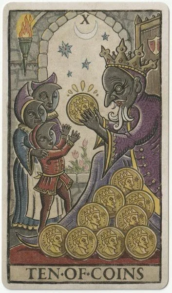
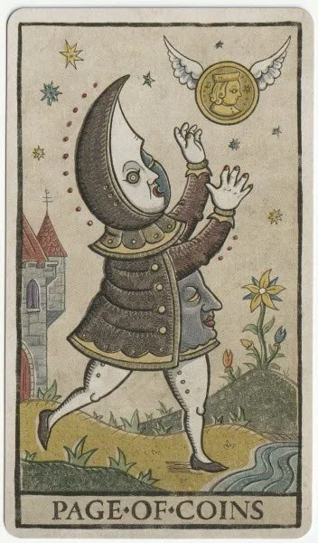
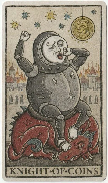
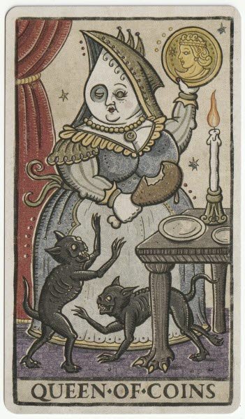
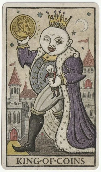
The pentacles are renamed coins; a minor tweak that doesn’t distract the reader in any way. The Two of Coins is a quirky character who is clearly adept at maintaining his balance irrespective of the ongoing chaos around him. I like that the characters in the Three of Coins remind me of the same suit from the Deviant Moon — Trionfi Della Luna shows a craftsman and apprentice rather than leaning into a more obvious example of teamwork. The Four of Coins emphasises the Scrooge tendencies that are often highlighted by this card. And if the gleeful rubbing of hands over his pile of coins didn’t trigger the Scrooge vibe, the shadowy ghost in the back of the image would certainly have evoked the ghost of Christmas past. Now and again, there’s a solid reference to the traditional tarot depictions, and in the Five of Coins we have the cloaked figure out walking in the snowstorm with the coins embedded in the stained glass window of the church. I quite like how charity is depicted in the Six of Coins; not only are coins being held out towards the fish out of water, as the man bows his head toward the fish, the water is pouring out from a vessel on his head toward the fish. There could be a sneaky reference here that giving should be done from the heart. The Seven of Coins are particularly colourful, and rather than finding the card boring, as I often do, this seems to be suggesting that the harvest is actually worth having. The LWB affirms this, and says it indicates signs that efforts are paying off. Hard work is the theme in the Eight of Coins, and with the man sweating from the full sun bearing down on him while he digs the ground, it’s reassuring to see the coins just below the surface. I like the artwork here, although it’s a little different from the regular theme of learning one’s craft or developing skills. The card is putting the emphasis on effort and hard work, which is probably where it should be. I am always curious to see the Nine of Coins, and Patrick has really gone to town with colour in this one. The woman is adorned in a feather-like cloak, and it is every colour of the rainbow. We can see her dress underneath is showing the same colours, and I wonder if there is a quiet reference to authenticity, or at least some consistency of character. A vibrant parrot is perched on her hand, and the LWB suggests the bird is eager to learn from the woman’s successes. Interestingly, the wings on the woman’s back look white — is this indicating a purity of sorts? The Ten of Coins shows ancestral inheritance and the blessings of family wealth. It’s a traditional depiction, yet an often overlooked aspect in more recent decks. I actually like the court cards, again. I love the lazy Knight and think that showing him yawning while sitting on a dragon is a positive descriptor. The potential is there; he just needs to move a bit quicker. The King and Queen are very different to cup versions. This pair don’t look as approachable, but they’re not scary either. Both characters are rounder and fuller in the face and body. The Queen in particular draws my eye because she’s holding a coin and an oversized chicken leg away from two demonic cats that look half-starved. The LWB confirms the instinctive read — she’s probably not the most generous person on the planet.
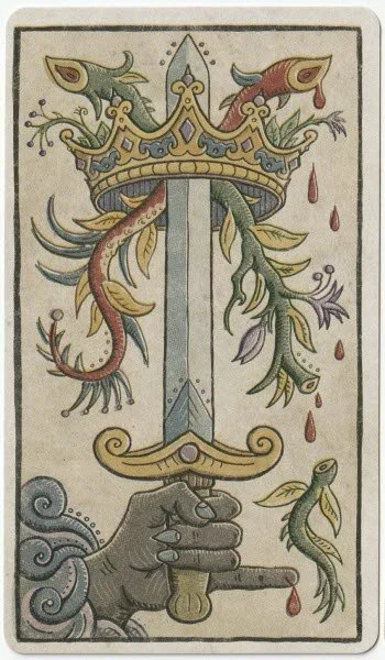
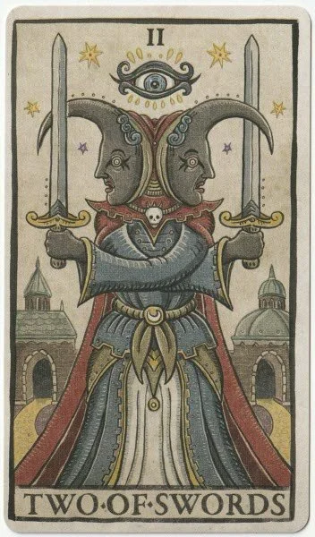
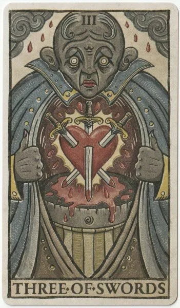
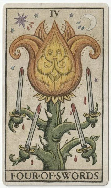
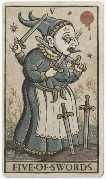
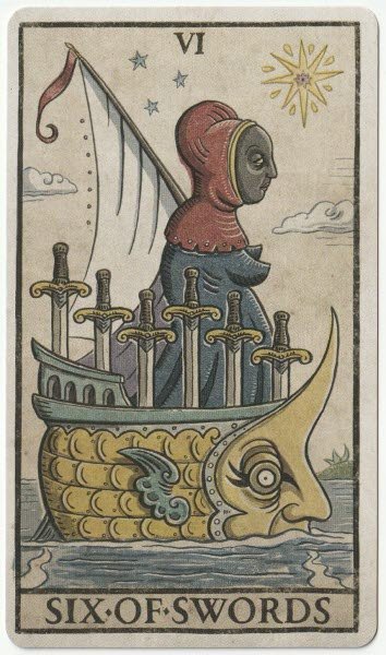
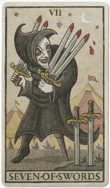
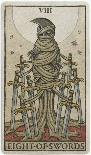
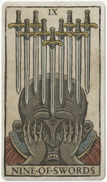
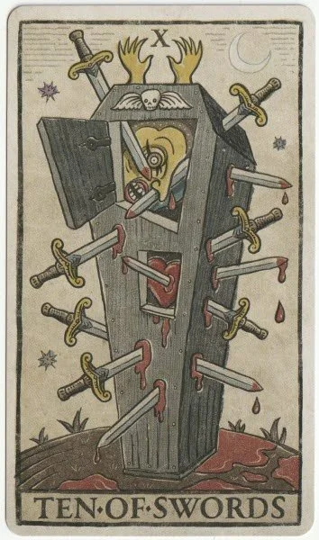
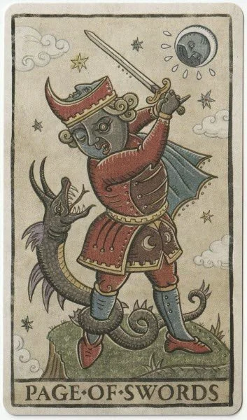
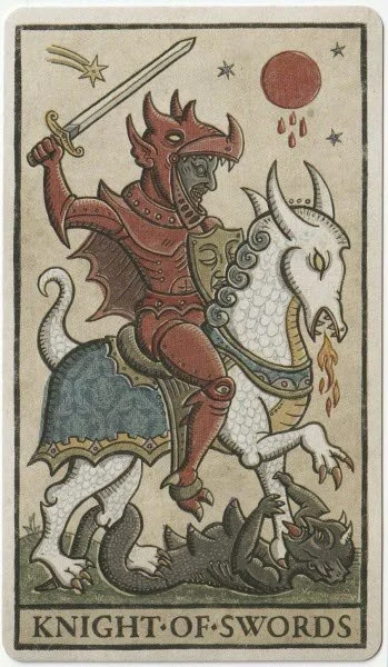
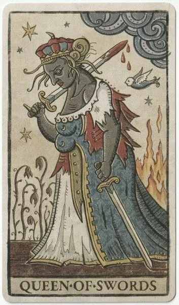
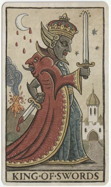
I’m excited to get on to the swords — I even like the Two. I love the implication of balance and seeing both sides that is shown by the Janus-headed figure. The figure has her arms crossed, and this may serve as both protective and defensive; the swords act as one element of protection, but the arms covering the chest area suggest a more sophisticated defence mechanism than one might expect. Or is she ignoring her heart? The Three of Swords is explicit enough in its message, with the man displaying his pierced heart for all to see. I like that the artwork isn’t overdone and yet its message is unambiguous. The Five of Swords may well be my favourite card so far. I generally grit my teeth when it turns up in a reading because I know that whatever the situation, no one is coming out of it a winner. Further, there is always an element that any ongoing mental torment is being done to the self because of a refusal to make the right decision. The LWB says, “Using two swords like a giant pair of scissors, a distraught woman attempts to snip off her own head. From behind, her third hand raises another sword and readies to plunge it into her back. Two remaining swords stand in a mound of dirt, waiting to finish this deadly task should the others fail. Upright Meaning: Competition. Conflict. A bully. Intimidation. A criminal act. Aggression. Unprovoked violence or hostility. Self-sabotage. Reversed Meaning: A resolution to a tense situation. Compromise. Reconciliation. An end to hostilities. Making amends.” Honestly, though, I’d just move on. Is the battle even yours to be fought? The Page of Swords is one angry-looking dude and is doing battle with a serpent that has wrapped itself around his leg. It’s an active scene, and one doesn’t need much of an imagination to guess at the kind of personality traits it suggests. The Knight of Swords is another fierce warrior-type, and we can see his fire-breathing horse is trampling on a demon. The King and Queen are the first pair to be standing back to back. The Queen doesn’t look all that happy, and while she has blood dripping from the end of one of her swords, I’m wondering if she actually won the fight. The LWB informs us that she is indeed disheartened but won the battle, and simply did what needed to be done to maintain her dignity. I like the presence of fire behind her on the card, and that she’s now in line with a crop of flowers — it gives the impression of some type of transitional state. The King is a different character, and while he may look noble from the front, he’s holding a bloodied dagger behind his back. The moon drips blood, and a volcano is erupting in the distance, and yet there are stars around the tip of the sword he holds out in front. A man of two sides, perhaps? I have to say, again, I’m definitely liking the court cards in this deck.
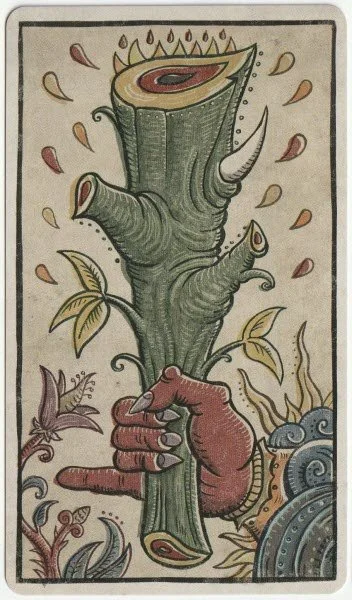
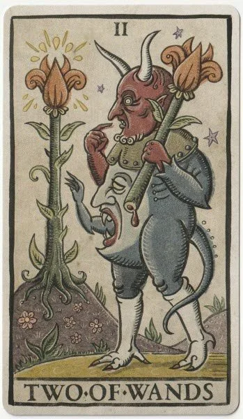
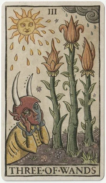
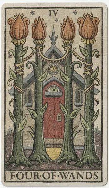
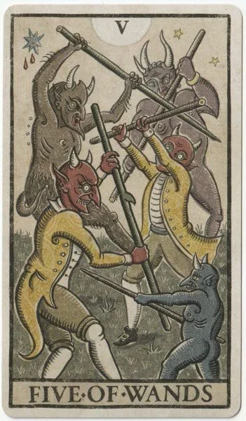
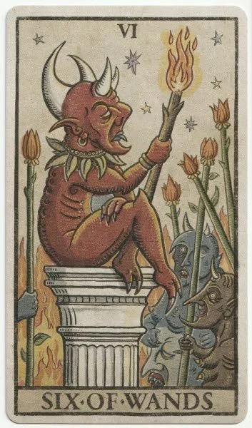
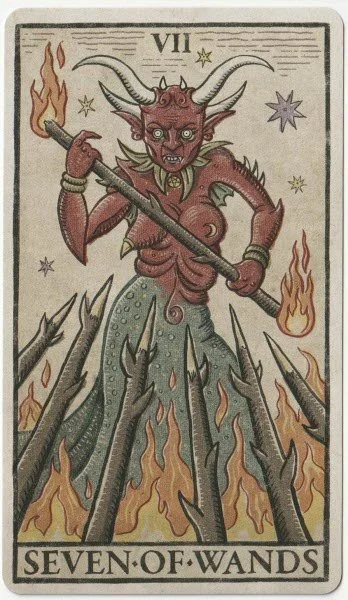
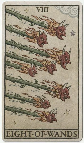
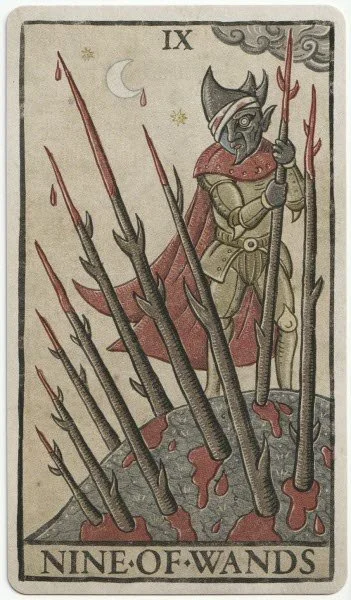
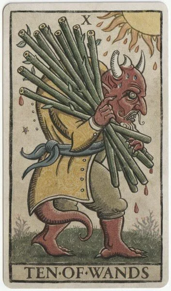
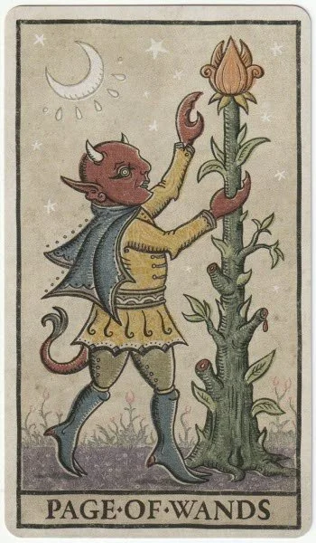
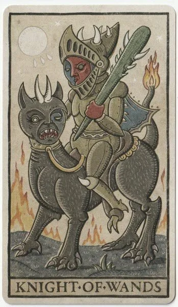
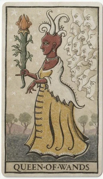
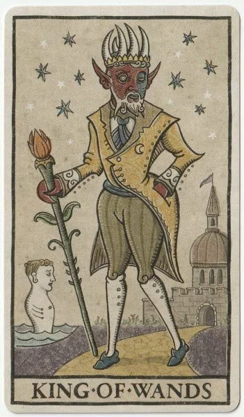
And finally we come to the wands. The Two of Wands can be an odd card to understand at times, because there is generally not that much going on to say it’s the element of fire. I like the artwork on the card, but I’m curious about the demon-headed figure and what he’s thinking about. The LWB says, “Strolling along a garden path carrying a freshly cut flower, a demon suddenly encounters a similar plant growing on a hill. Realizing his original find might not be as special as he once thought, he contemplates whether or not to pick the second one. Upright Meaning: Creative decisions. Convergence of ideas. United efforts. Business partnerships. Bright prospects. Global dealings. Reversed Meaning: Indecision. The inability to synthesize ideas. Lack of creativity. Disappointment. A life of mediocrity.” That all makes sense with the artwork, and I like how Patrick has mentioned the inner conflict that often arises with creativity. It’s a very useful interpretation because it talks about the potential reasons for the indecision. I love the Four of Wands and really like that there’s a house showing in the background. The stability inherent in this card is rarely appreciated — but if anything, I prefer it to the Four of Coins because it usually implies a more contented sense of well-being. The almost arrogant-looking demon in the Six of Wands is a nice depiction of glory, and I like that he’s on a pedestal of sorts and the crowd is looking up at him — it suggests that any attention has been earned. The Eight of Wands is unusually aggressive thanks to the wands each having the head of a demon. I think the fact that the wands are facing downwards adds to the sense of attack. The LWB says the wands have a target and will land soon enough, and if this card comes up in a reading, it suggests having to be bold and direct. The court cards are lovely, and there is a sense of gentleness in the way the Page of Wands is grasping a flower, ready to pick it. He is so radically different from the Page of Swords. The Knight of Wands is clearly ready for battle and seems unbothered by the flames. His gaze is fixed on whatever is ahead, and I like how it suggests focus and determination. Our last King and Queen are different to all the other pairings, and I think that says a lot about Patrick’s commitment to the deck as a whole. He could’ve kept them all the same and just changed the element, but instead he’s given each its own character and then portrayed each of the couples in a different light. The Queen stands facing her King while he stands forward and looks slightly off to her side. The Queen has an interesting outline of many faces behind her. The description in the LWB says, “she is unaware of the misanthropes that whisper hatred behind her back.” Maybe it’s not such a bad thing that she seems oblivious to it all? The King of Wands is the most noble-looking King out of the four, and his demeanour is calm, regal, and assured. The LWB calls him dandy, and that, he certainly is!
I really like the Trionfi Della Luna Tarot and have thoroughly enjoyed working my way through the cards. There isn’t much more I can say other than this is one of a very small number of decks where I don’t actually have a least favourite suit. I am impressed with the whole deck because it’s consistent and has both character and depth. I particularly like the court cards because they so often bore me in other decks. I love the descriptions in the little white booklet, and there was clearly a lot of thought that went into what was said. Because I loved the Deviant Moon, I wondered whether this one could be any better. I now think better was the wrong word; it’s as good as Deviant Moon and also different despite being clearly related. I like that Patrick used The Moon card on the front of the box, as he did with Deviant Moon, but this is more than a simple colourised version of its predecessor. The translation for the title is Triumphs of the Moon, and I like that! Yes, I’d recommend it for beginners and experienced readers alike — it’s a solid deck and the meanings are generally clear from the artwork alone.
Before I sign off, I have almost finished the page for the deck giveaways. The Trionfi Della Luna will not be leaving me, but I have ten other decks on the list so far. I am too late to do a draw for Lammas and hope to do the first one for the autumn equinox.
Recent Posts





Archives
Categories
- AI Decks
- Animal-centred
- Books
- Decks For Self-development
- Difficult Decks
- Expensive Decks
- Lenormand Decks
- Oracle Cards
- Oracle Cards For Beginners
- Out-of-print
- Personal Favourites
- Published 2000s
- Published 2010s
- Published 2020s
- Tarot
- Tarot & Oracle Sets
- Tarot Cards For Beginners
- Under £15
- Under £20
- Under £30
- Under £40
- Witchy Decks
- Woman-centred

Details for the tarot and oracle giveaway for September 2026.